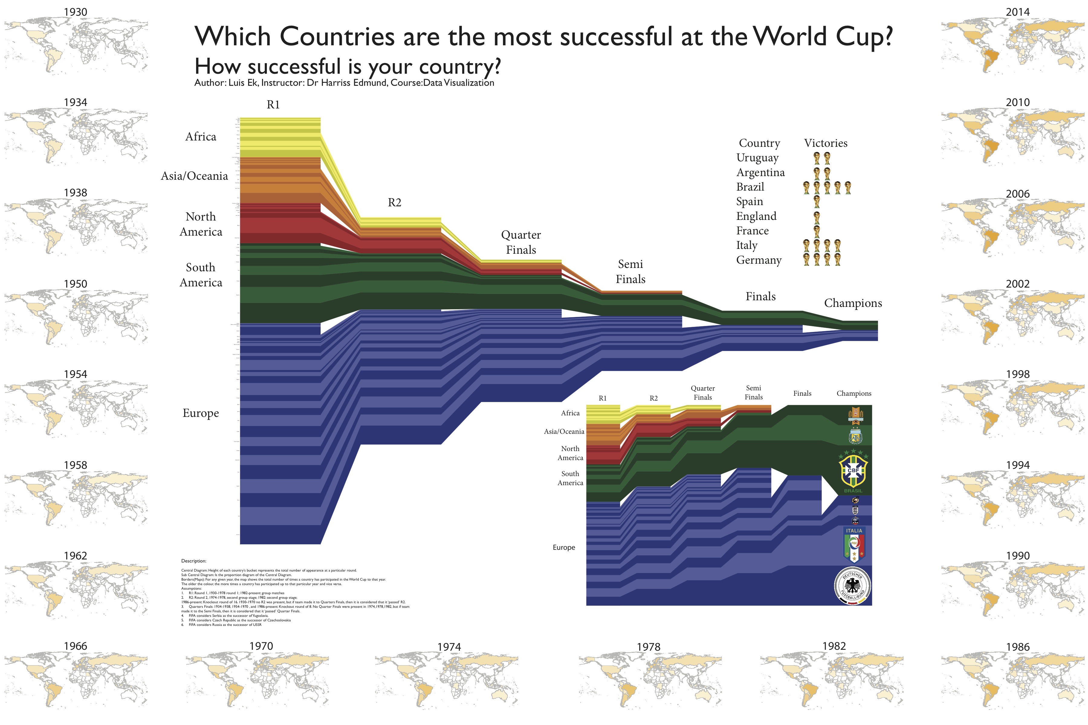
The above graphic fails to be a successful (or particularly useful) visualization on multiple accounts. On one hand, it is labeled properly at the top (we know what the overall intent of the graph is) and color coordination is generally straightforward (one type of color per continent represented). But yet this visualization still is a lot to digest and overall quite unclear. For one, there is no real reason that each individual country needs to be connected between one round to the next. All this does is muddy up the space provided. As well, other than general labels for continent, trying to track individual country’s progression is nearly impossible. One would assume that the two different shades for each color might represent region or some sort of grouping for countries, but it appears arbitrary.

This graphic appears to be straightforward at first glance, but upon closer inspection it’s clear to see that it’s overly complicated without much justification. Not only is the general sentiment of climate change displayed by country on top of a map of the world, each one of those has a three-dimensional pie chart to show the full breadth of opinions on the subject. Not only that, but the actual depth of each graph also represents a whole other criteria concerning the ratio of individuals who were and weren’t certain. Especially from the angle chosen, this graph is legible but only after careful examination.
Leave a Reply