In everyday media such as magazines and newspapers, we are constantly bombarded with attractive graphics that attempt to catch our attention while displaying useful data and statistics. Unfortunately, even the best looking graphics can have major flaws. Below, we’ll explore some example graphics and try to find where they went wrong.

The intention of the map in the above graphic is to visualize the statistic, “29% Millennials (Born after 1980).” Firstly, it is difficult to understand what this statistic means. It could use some additional context or explanation. Moving to the map of the image, the bottom of the bottom of the map is filled in proportionally to statistic, but there is no reason to use a US map since the location where the map is filled in does not relate to the statistic at all. This map misleads people into thinking the that millennials live in the south, and therefore poorly implements the usage of self-representing images.
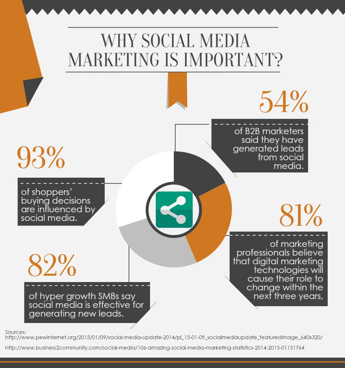
At first glance, this chart is confusing because the percentages do not appear to match the relative sizes of the chart segments. For example, when seeing a percentage such as 93%, you would expect its corresponding segment to fill 93% of the chart. This graphic could have been better implemented using a different type of visualization for the statistics. Additionally, the graphic should have provided additional data or further explanation to help the viewer understand the importance of social media marketing, as was expected from the title.
Leave a Reply