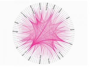
I chose this one as my first example because it literally caught my eyes at the first time. This visualization is very clear and simple with its format and color. This piece for an Airbnb presentation maps out Airbnb’s top 50 markets. The thickness of the lines corresponds to the relative volume of travels between each pair of markets, which are labeled along the outside of this radial network visualization. The interesting thing I found with this one is that it gives you several feelings at the same time. Instead of numbers coming to your eyes, the color, thickness of the lines, the bigger names and the interaction with the lines all show up to you at the same time. So people can form a kind of intuition of what the picture want to deliver. It is easy to find that New York, Paris and San Francisco are the three places with the most lines interacting with the rest places. And the line between New York and Sydney, New York and Paris are much more thick than the others so that people know the general shape of the information before they find the exact data, (there is even no exact data.).
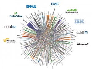
This one is of the same type, but more clear in the difference of the colors and lines. It shows the connections of companies in Hadoop world. Again very much information would be acquired from the first sight of the visualization. Those big names, thick lines and color all represented different information offers you the whole thing about this topic. Although with explosive amount of data, it requires you to find more about the topic as you dig into this picture to form you own idea.


Leave a Reply