This week, we are introduced to 2 new tools for visualisation: Palladio and Google Fusion Table. Both of them are very good at doing network visualisation and raw data analysis. It is a big different when I am using these tools comparing to the experience with Voyant and Jigsaw. Different from text analysis, cleaning data is not the most important part in raw data analysis tool but building data structure really means a lot. Table based data visualisation provides different results comparing to the text based visualisation. It is more clear and clean in data but in the other hand, It is more predictable.
Raw Data Preparation & Data Structure Design:
Palladio and Google Fusion table are very good at doing network visualisation but in my opinion, as two data tools working specifically on tabular well organised data, I would categorise those two as comprehensive raw table data analyse tool instead of networking tool. So, we decide to do research on three interesting factors: time, space and relationship while we are comparing two tools. We find a database on wikipedia collecting war happening in the world from 1900->1950, the fast changing period that forge today’s world. In that database, we collected start time, end time, war name, victor and loser as our database scheme. Time, Space, Relationship are all together in the database for visualised.
We choose not to stick on our RPG research because we want to test all the features on those 2 platforms. Most RPG games are developed and sold on Japan and North America so It is really hard to do a spacial visualisation. Then, the relational visualisation is quite success in previous project.
Palladio: Beautiful yet low Performance
To speak frankly, I love the design of Palladio website. It is incredibly beautiful among the visualisation tools. Because I have experienced Jigsaw, Gephi and old version of Voyant, the modern simplicity design in Palladio is really catchy. However, the actual experience of using Palladio can be described as suffering. As a data analysis tool/network visualisation tool, Palladio can hardly process over 300 lines of csv data. Our database has around 300 lines of data and the network visualisation between Victory and Defeat can spend over 1 minutes while I use a quad core i7 processor + 16GB memory. So It falls into a really embarrassing situation that It can do very beautiful visualisation with small amount of data but network visualisation with small amount of data most of times is not really meaningful. However, one of its feature still catch me. It is called timeline. It is able to create timeline from the data scheme provided by me. Here is a visualisation of War Country Involved vs. Time. In this visualisation, WW1 around 1910s to 1920s involved the most countries (The colour of the bar is kind of meaningless). And with the time changing, many countries leaved WW1. The change is more like a linear recess, that is the decrease in country involved is not rapid fall but a step by step path. However, If we take a look at WW2 from 1938s to 1945s, things get different. The countries involving tend to be a lot more rapidly. Then It is interesting that before WW1, countries involved in war is higher than WW2 but we all know WW2 damage really a lot. So, we can conclude that modern wars with higher damage and rapid involvement, they deal more damage and end quicker. Countries get quickly involved and end(die) fast. For Palladio, I tried to use it as a data visualisation tool for networking but its performance stops me.
Google Fusion Table: Powerful Google Tool:
Cool Feature @ Katie : Automatic Geocode
Fusion Table might be the coolest tool I’ve tried ever, I made three visualisations with this tool. It is high performance and easy to use/with a lot of fancy features. Before introducing my visualisations, I would introduce you about a cool feature that might be helpful. @Katie as promised this is for you. This feature is called automatic geocode. If you input address in th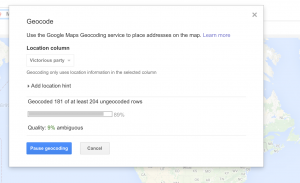 e table, you can change its datatype into: Location and Google fusion table will automatically using Google Map’s api to find the latitude and longitude data the address trying to locate. It will leave unsuccessful geocoded address as ambiguous and converting most of the address into a point on the map. It will help really a lot in data collecting and processing. 🙂
Visualisation 1: War Duration Time Vs. Time Histogram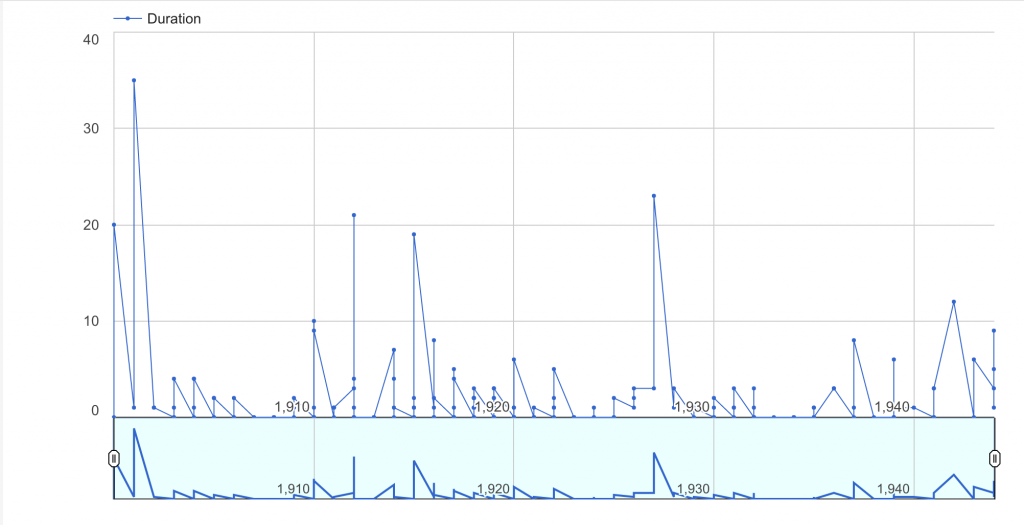
For this visualisation, I did a research on the duration time(the y axis) on the war starting time(the x axis). The upper side of the visualisation is the actual dataset while the lower side of it is the standardised graph of the relationship (only show the change in data but not reflecting actual data size). The first interesting fact is that there are a lot of wars in the world ends in one year. The point “on the ground” represent those wars. Then it also reflects my points made before, that war in old times (before 1940s) tend to take longer time (over 20 years) but modern war with higher damage always start fast and ends fast. The rapid change in technology and society also rapidly change war form. WW2 in this graph is not a very huge “tooth” but damages the world most.
Visualisation 2: Defeat Country Map Visualisation vs. Victory Country Map Visualisation:
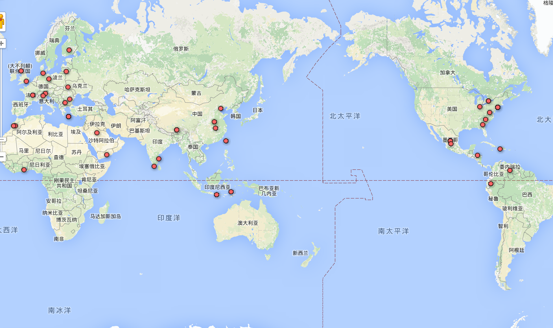

The first one is victory countries while the second one is defeat countries. (It is in Chinese because my operating system is is Chinese haha). From the graph, we can find a lot of points on Europe for either victory or defeat. That implies europeans in 20th century really love war. Then, from the defeat graph, we can see a lot of points on South America. it might lead to the fact that there is either revolution or de-colonialisation around 1900s to 1950s in South America. It is not a very “surprising fact” but still kind of interesting.
Visualisation 3: Relationship Map between Victory Group and Defeat Group:


In these 2 visualisation, I label victory countries as blue and defeat countries as yellow. Size of the node leads to the involvement of this country in the war, either in time scale or in space scale. In order to make the visualisation clearer, I clean the data a little bit. (wiping out small wars and combining some countries with different names). United States is significantly huge in this graph that explains a little bit about its dominant position today. And China, also involved a lot of conflicts and wars during 20th century. But, a very interesting fact really catch me. It is that the biggest nodes in the graph are not those WW player but the civil war and regional conflicts players. It might be the reason that the length in time in the regional conflict tends to be a lot longer and the cost will be a lot less. Also, It provides us another insight looking over war that comparing to world war, maybe civil war and regional conflicts with a long lasting time can really suffer people the most. However, this “conclusion” are only involved with the scale of time without any analysis on the scale of war. It also provides us another insight to our visualisation problem that how can we know if our visualisation is not misleading. I would say this one is a little bit misleading but it also reveals something. But It still informs us to consider the problem of misleading visualisation when we are doing this kind of work.
Leave a Reply