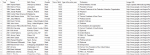
I chose to take the Nobel Peace Prize Winner (1994-2014) as the target of my research. I didn’t stick to the stock market topic because that one is barely geographical. I would like to find out the similarities and differences of Nobel Peace Prize Winners through this research. Here is my own constructed spreadsheet.
I have 8 columns and 30 rows (29 winners in 20 years). In columns I have “year, name, birth place, year of birth, gender, age when got the prize, profession and image URL” as my entries because those are things in which I try to find connections and relations in Palladio. I also constructed a place-coordinates table in order to work in the “map” in Palladio.
To be honest I love Palladio more than Google Fusion Table because I feel that Palladio is more user-friendly and antithetical. Google Fusion Table is definitely a stronger tool but I can’t get enough out of it with my data (maybe it works better for larger data).
Here are some visualizations form Palladio:
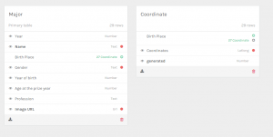
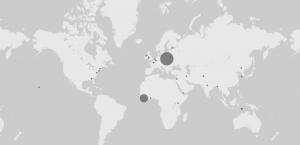
This one is the metadata? of my own constructed data. It is very clear to see that I have 29 identities in the spread sheet and each of them has been defined with certain value of “year, name, birth place, year of birth, gender, age when got the prize, profession and image URL”. It is quite confusing for me to work with the map part as you may see next. Palladio does not work with place names, instead it eats geographical coordinates and spits out points on the map. So I used google map to find each place a coordinate .The map looks ordinary and reasonable enough so I can probably guess that the Nobel Prize Committee does not have any preference of countries and regions for the prize.
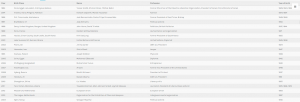
It is also quite useful to use the table view in Palladio. It helped me to categorize my dataset based on the criteria I chose. For example, the following screenshot represents my data categorized in years. You may find there are some years that have multiple winners. A little flaw is that I cannot put that in the chronological year order so that looks clumsy in the first column.
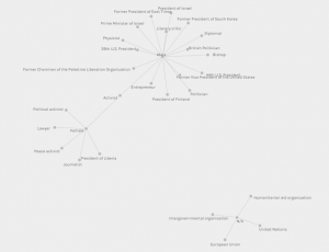
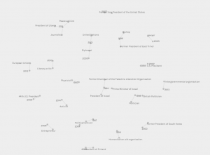
And the biggest thing in Palladio would be the connection part for my dataset. That’s where all these different information gets ordered and connected. I chose 3 meaningful visualization as examples: “Profession-Birth Place”, “Gender-Profession” and “Year-Profession”. One would find out that through these 3 visualizations there are lots of interesting hidden information. Almost all the winners have something to do with politics and there are much more males than females that have won the prize, etc.
These visualizations, in my mind, really provided me with a brand new perception of my data. Once the data is made into graphs or different arrangements of elements, certain meanings are attached to them and people could easily get them through the human nature. That is the biggest power of data visualization.

Leave a Reply