I have chosen the dataset of Penn museums. Since the dataset is so big that it worked very slow with neither Palladio nor Google Fusion table, I use the part of the dataset about Europe museums in Penn. I feel that Palladio and Google Fusion table are both good at analyzing this kind of raw material, and can create useful visualizations. I planned to do researches on the relationships between time period, and cultures that museums focus on. When I was playing around with Palladio and Google Fusion table, I also found that the materials that museums used interests me a lot. I think that could be one of the attractions of data visualizations: they will continuously bring me new discoveries that I did not pay attention to before.
Palladio
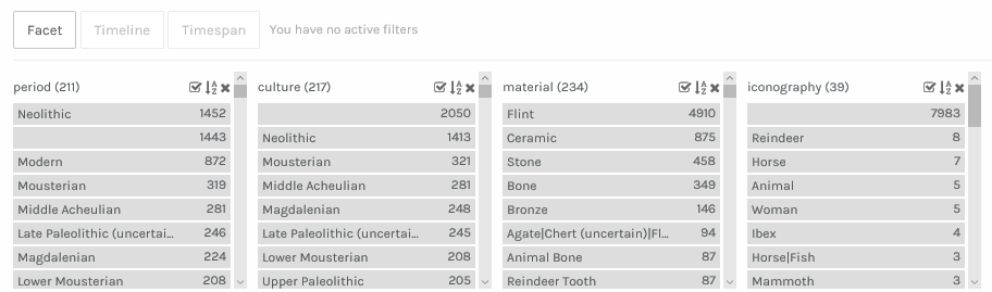
After I loaded the data into Palladio, I stated from finding the major time periods of these European museums. The Data tool in Palladio is really helpful when I chose to sort by frequency, I can immediately see how the museums’ building time are different. Then I can search “Neolithic” to see the smaller differences among the same period “Neolithic”.

When I changed to another element “Iconography”, and downloaded the list of icons European museums used, that really catch my eyes and motivated me to do deeper researches about old European museums.

I also found that facet tool in Palladio was very interesting. It can better arrange the data in different ways to show the frequencies according to different elements.
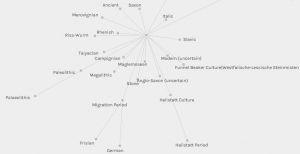
While using the graph tool to create the relationship between time periods and culture can create a clear and organized network, it left me some confusion about how the lines related to each other.
Google Fusion Table
I think the Google Fusion Table is really cool because it makes the complex dataset really concise. When I was playing the card tool in the Google Fusion Table, I found it really useful and convenient for me to adjust the format of the card. I can choose how many cards showing at the same, and I can also delete the information that I think is useless.Compared to the Gallery tool in Palladio, although the Gallery is aesthetic, the Cards make it easier to analyze the materials.

Using the Summary tool in Google Fusion Table is really engaging. The different colors represent different elements that I choose. Like in the picture, Blue dots represents time periods and yellow dots represents culture. It becomes easier for me to find the key period “Modern” since I only need to look at the blue dots. Moreover, when I click the dots like “Modern”, the most related lines will be bold. I think it is helpful for me to find relationships between two elements through that function.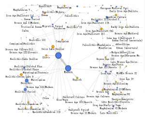
It is hard to say which one is better between Palladio and Google Fusion Table. It is ever hard to say if I preferred Palladio to Google Fusion Table. The Palladio’s design is very beautiful, and when I was playing with it in class, the gallery with pictures caught my attention immediately. But the Google Fusion Table is so clear and it makes the process of researching and analyzing data an enjoyment. The visualizations that Google Fusion Table create can actually explain the existing data and encourages me to dig deeper into it.
Leave a Reply