After my initial findings from assignment 2, I was curious to see what other conclusions could be drawn from my corpus of children’s speech. The most interesting finding from that assignment was the ability to plot the relative relation of individual word usage by both frequency and spatial relation. It became apparent from these findings, somewhat intuitively, that mapping the spoken utterances to the actual individuals who spoken them would be the next step in visualizing the data set. Instead of merely mapping the words with each other, determining the relation between words spoken and characteristics of the speaker is something which has the potential to lead to some interesting, and hopefully enlightening, conclusions.
Determining which aspects of the speakers to map to word-usage (and how exactly to do this) was initially a challenge, especially in converting the data into a csv data format. I contemplated whether or not individual word frequencies would be a useful metric for analysis, or if dividing up my given word data into sub-categories for various aspects of speech would prove more fruitful. As far as speaker characteristics, I decided that two of the most general (but also most insightful) factors would be individual age and individual age. After parsing back through my original data set in order to map this gender and age data, I realized that individual word categories might not be as informational as using a mapping of all word-utterances in relation to speaker characteristics instead. While breaking up the words into parts of speech or by noun types might have been interesting, seeing the connection between overall word-usage appeared to be indicative of a stronger visualization as a whole.
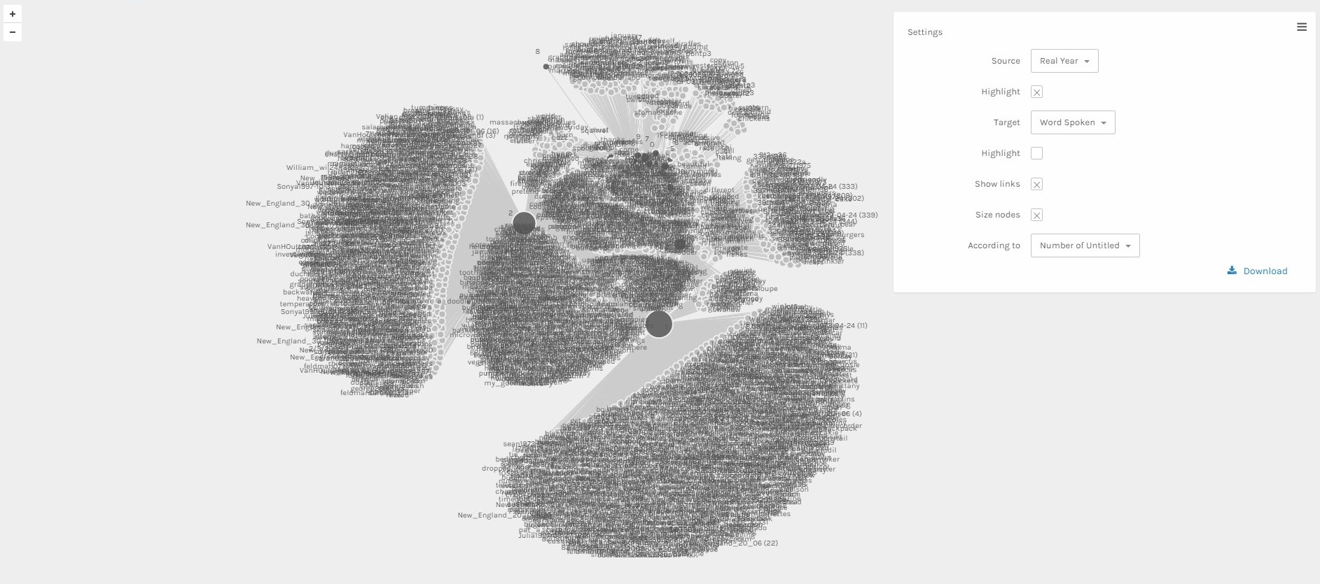
This first visualization maps vocabulary usage to age of individual speaker. The highlighted nodes represent different ages while the remaining nodes represent the actual words uttered by individuals of the ages which connect them. This visualization is very interesting in mapping the intersecting nature of vocabulary and word-usage among different age groups. We see a large concentration of words branching off of the tow lower-most age nodes (representing the ages of 1 and 2), but also a large number of intersection between the two. As well, as the age goes up, the interconnectedness of vocabulary only grows, with higher age groups clustered together higher above the lower age groups. If this wasn’t so hard for Palladio to render on its own, I’d be very interested in increasing the data size with an increased vocabulary and number of age groups to see just how extensive this age-related connectivity really is.
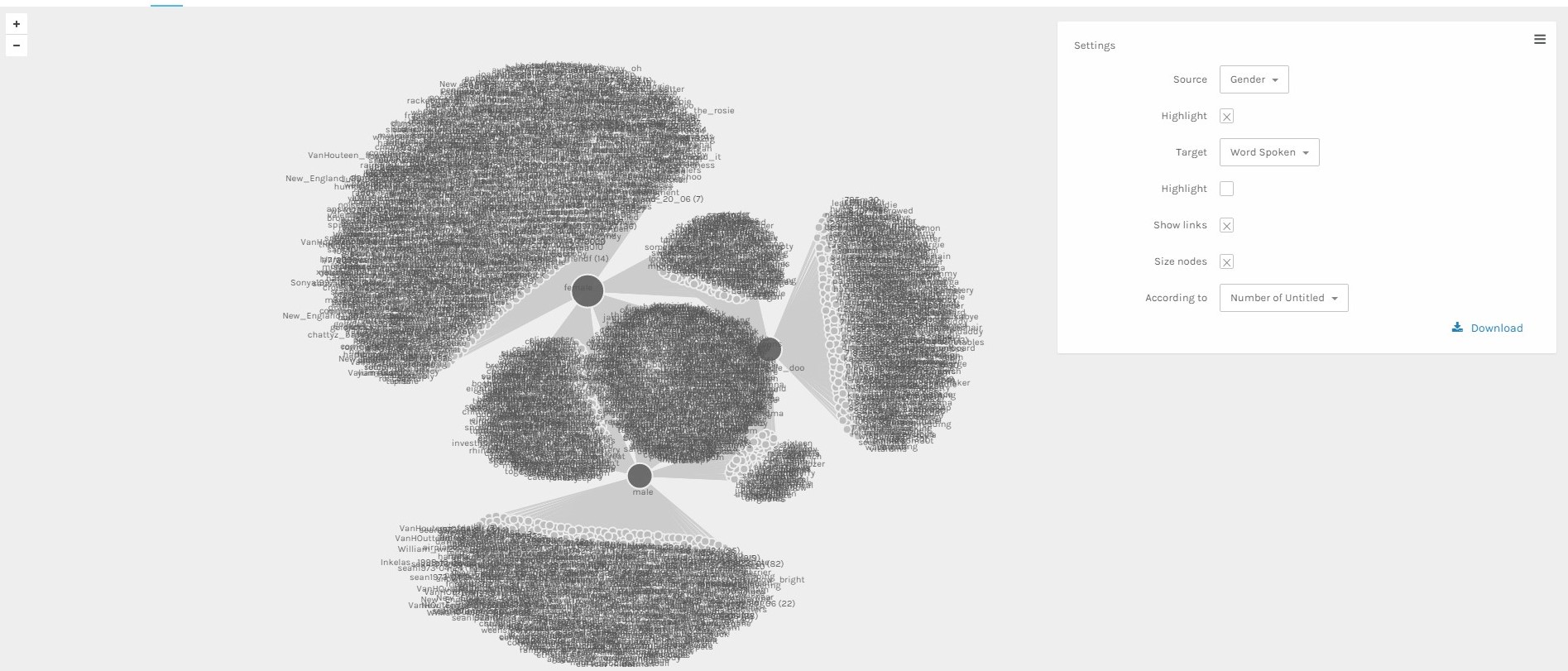
My second visualization maps vocabulary usage to the recorded genders of the individual speakers. I find this visualization to be particularly interesting in how clearly it is able to convey the obvious differentiation between vocabularies of the various genders. While one might intuitively assume that essentially all, if not at least a majority, of vocabulary should be spread evenly between speakers of each gender, we can see that this doesn’t appear to be the case. The three recorded gender subsections (male, female, unknown) map together to have a good deal of intersection between them, but an even greater amount of bisection in unique vocabulary usage. From the network, we can analyze the varying ways in which individuals of different genders form vocabularies and where they overlap.
Both of these visualizations, though capable of spawning analysis and conclusions, are more representations than they are knowledge generators. This is largely due to the fact that despite the various lines denoting connections between nodes, the actual spatial relation between nodes doesn’t carry in meaning in itself. It is the connections themselves which have the meaning. Because of this, we are able to look upon these visualizations and see a particular mapping of information, but aren’t able to use the mappings themselves to discover some vastly different amount of information. The current arrangement of nodes and connections was done automatically by the Palladio system in order to better display the central nodes and more clearly represent the connections between each branching path. Nodes on opposite ends of the mapping are no more unrelated than the node unconnected in its immediate vicinity. To view networks we must not think in terms of place, but in terms of connection.
Leave a Reply