I chose sample dataset from Palladio.
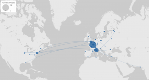
In Palladio, there are five different views. The first on is map:
Data can be presented on a global map according to the geographical information provided. Each node represents one piece of data and it can be connected by lines if there is logic connection potentially. In this view, it helps users to visualize potential interconnection of different information provided in the dataset. In this example, it displays the places where certain person was born and dead.
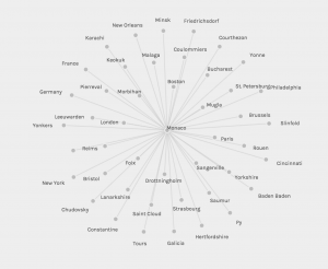
The second one is Graph:
This is pretty much like the one in Jigsaw. Users are allowed to pick a source and a target, then Palladio will find connection in-between and connect them together by lines. The scale of dots can be relative, depending on the quantity or magnitude. In this case, I chose Arrival points as source and birthplace as the target. It is pretty straightforward to realize the fact that all people in this data set arrived Monaco.
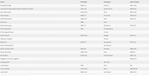
The third one is Table
This one is pretty self-explanatory. Users can first choose row dimension and then fill with related information accordingly. It is a convenience tool that can help users to organize the data as the way they want. Also just like other spreadsheet tools, users can also sort the table by certain column and in this out case, we can sort all data alphabetically or chronologically.
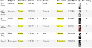
The last one is Graph:
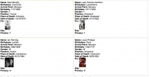
This is just fancy. It is similar as the table but organize data in another way. It helps users to collect facts about different entities in a flash card-like view. It helps users sort and organize data in different ways for quick reference. In this example, it simply displays each people’s basic information and portraits of themselves.
For google fusion table, it has similar features than Palladio. The first one is rows.
It looks like it is premade already and less manipulative than the one in Palladio. It dumps all information into one spreadsheet, which might be helpful to quick look up.
The second one is card view:
It is almost the same as the one Palladio but actually more powerful. For the one in Palladio, users can only select limited amount of information to appear on each card. For google fusion table, again, it just brutally dumps everything into it, in a good way.
The last one is map view:
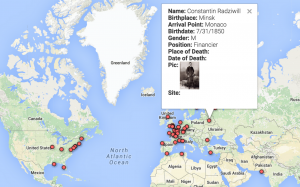
It combines both the visualization of data based on geographical information and the detail of each entry at the same time. This makes Google fusion table more powerful and certainly can save user’s time on switching back from different visualizations.
After using Palladio and Google fusiontable I can start understanding Drucker’s idea of visualization interpretation. Especially for Palladio, it gives users a high degree of freedom to combine and connect different pieces together, without caring if such connection makes sense or not. As she mentioned in her paper that “Subjective meteorology is an elaborate and idiosyncratic system. “, how to use such tools properly could be an interesting topic because sometimes we do need to run some random test to rule out those do not make sense and keep those worth for further investigation. Although I do not agree with her opinion, it is still a fair warning about what might confront to when we work on our own project.


Leave a Reply