For this assignment, I chose to visualize Bucknell’s database of course information for the Fall of 2015. Specifically, I wanted to see the relationships between CCC (College Core Curriculum) requirements and courses across different departments in the University.
 I created my dataset by generating a CSV file of course data scraped from Bucknell’s online course database. Each row consists of a course number and a CCC requirement filled by that course. This setup means that there are some duplicate entries in the table for classes that fill multiple requirements or have multiple sections. I used this structure because Palladio and Google Fusion Tables are capable of sizing the nodes by frequency of the number of sections or requirements filled. Unfortunately, this also means that there is loss of information as there is no visual representation of the courses that do not fill any requirements. Additionally, by choosing to
 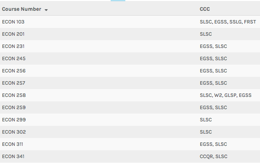 scale the sizes of course nodes by the number of times they appear in the CSV, we lose the ability to scale nodes by the number of students enrolled in each course, which may also be of statistical significance. As this is a large dataset, I will be applying filters by department to show subsets of the data when displaying screenshots of my visualization.
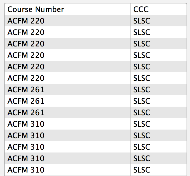
In Palladio’s table view, we can see how the software combines the multiple requirements for  courses into a single table row, but it doesn’t keep track of the number of sections or links between courses. In fact, this table essentially reproduces the data that is already available on Bucknell’s online database, so there is no knowledge generation or anything interesting or thought provoking about this view. Similarly, the gallery view does not provide any additional insight to the data, as it does not intuitively visualize the data I have provided.
The graph view, on the other hand, does an excellent job of relating the differe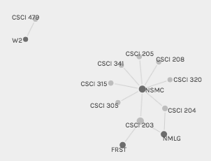 nt courses and their associated CCC requirements. Edges are drawn between courses and CCC requirements, and nodes are sized according to their frequency of appearance in the dataset. Because the view is interactive, you can click and drag nodes to look at them individually and see in detail how the edges are connected. Palladio also allows you to highlight one set of nodes, which I used on CCC requirements, as they tend to be difficult to find amongst all of the courses.
Although Palladio is able to produce visually pleasing graphs, I found that Google Fusi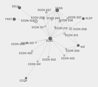 on Tables was able to produce even more beautiful graphs with some of the fine-tuning that this robust tool offers. I was able to color nodes by their category, which is especially useful for the larger dataset which has 23 nodes representing the CCC requirements that need to be easily differentiated from the hundreds of course nodes. Additionally, Fusion Tables highlights the edges of the node that is currently being moused-over, allowing the viewer to easily see what nodes are connected that node by edges. Lastly, Google Fusion Tables is better at scaling the size of nodes to make it easier to see which nodes are larger than others.
For this assignment, I have included network graphs for the Economics and Computer Science departments at Bucknell. From the complexity of the Economics graph, with its many nodes and edges, it is immediately evident that this department is much more diversely distributed between curricular requirements as compared to Computer Science. Different people will can look at these graphs and come up with different conclusions about the data. For example, from my perspective as a student, it makes sense that introductory courses have more links to CCC requirements because these courses are intended for the general student population, particularly those looking to fill their requirements with courses from other disciplines. As a result, this graph may be more useful to individuals more familiar with the intricacies of the curricular structure at Bucknell. They could use the full dataset of courses and CCC requirements to develop models and theories on top of this visualization to identify issues with the curriculum. As a result, it is important to consider the intended audience of what is being created, since data that might be intuitively understood to one person might not be as straightf
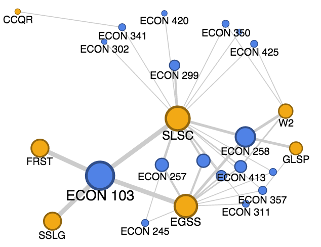 orward to another.
I believe that the above graphs meet most, but not all, of Lima’s functions for network visualizations. This system of relations has never been documented before, since we mostly see this type of course information in table form. The system clarifies our perspective of the information, since the graph representation allows for a better means for humans to understand the data by drawing edges between related nodes, sizing nodes by frequency, and color coding nodes by type. These visualizations allow individuals to look at the curriculum, either by specific subgroups or in its entirety, to find patterns in its structure such as potential gaps or overlaps in the University curriculum. The graphs, however, aren’t very good at showing multidimensional aspects to the data, due to the simplicity of the input data, since the input CSV file only had two columns. This issue partially stems from the limitations of Palladio, as the software has trouble supporting large datasets.
Leave a Reply