The data set includes information of Nobel Peace Prize winners from 1994 to 2004. Each column in the file titled was titled “year”, “Name”, “Birth Place”, “Age at Prize Year”, “Profession” and “Image URL”.
Because we want to do comparisons among three visualization tools: Palladio, Google Fusion Table and Gephi, we focused on the relationship between genders and professions of these Nobel Peace Prize winners.
Last time using Palladio to analyze the Penn museums was not an enjoyable experience for me because the dataset was too large, so it ran very slow and messy. The file this time is much smaller than the last one, so I found Palladio work really well.
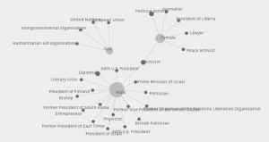
It is easy to choose gender and profession from the dropdowns, and we can find that more males are going in for political career; while there is a boarder diversity in professions of female. The best part of Palladio is the sizes of the dots. Larger dots represent larger amount of people, so it is obvious that more male win the prize, and organizations get the smallest part of the pie.
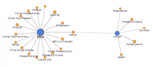
The Google Fusion Table also can do a nice visualization of the relationship between genders and professions.
I still really appreciate the colors using in Charts. As blue represents gender and yellow represents profession, it is easier to distinguish from these two colors than the black and grey in Palladio. However, the Google Fusion Table chart missed one important part – the organizations. I am a little confused why it was missed because even though organizations cannot be defined as male or female, it still has been labeled N/A in the raw file.
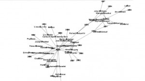
When we first time import the dataset into Gephi, we were surprised by how messy the data became.
We realized that Gephi will initially show all the information in the file, so we delete the column “Image URL”. But there is another problem that Gephi cannot recognize a person’s name. For example, “Yizhak Rabin” became two names in Gepi, so we changed all the spaces in names to “-“, like “Yizhak-Rabin” and it worked pretty well.
We changed the layout to “Yifan Hu” and ran the visualization. We got a visualization much like the one created using Palladio. The biggest difference is that the visualization created by Gephi list all the other information in the file including “Age at Prize Year”, and we cannot find a way to delete the extra information we are not planning to look at.
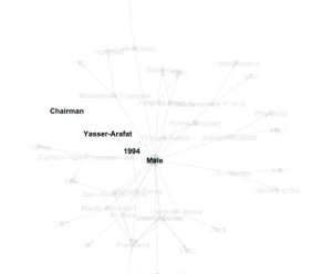
However, I found it really impressive that when I move the mouse to a point, the related information will immediately stand out since others become transparent. For example, as I move the mouse to the dot represents “Yasser Arafat”, I can easily found that he won the prize in 1994 and was a chairman at that time. Another element that I like Gephi is its Data Laboratory. It is so easy to add or clear a column while doing work. I think Palladio and Google Fusion Table may be better to deal with large datasets, while Gephi is really good to if we want to find relationships among more than two elements.
The process of dataset construction and creation of iterative visualizations addresses the most different advantages among similar visualizations. Even subtle details in visualizations will bring big influences on how the data information will be transferred to the audience, so cleverly choose a functional visualization tool is essential and meaningful.


Leave a Reply