Lately we have been digging into Gephi for more advanced technologies in data visualization. It seems that Gephi is definitely a more stronger tool than Palladio and Google Fusion Table but I cannot get the whole functions out of it in two weeks. I used my own constructed data set of the Noble Peace Prize Winners as I did in assignment 3.

This data set is quite small and my original .csv file has only 30 lines and 7 columns. I thought this could be so small for Gephi to run because all the data sets I have sampled in Gephi were huge things up to thousands of lines, making very beautiful and grand visualizations. But the first time I tried with my original data set in Gephi there were serious problems: Gephi takes every single word in every single box to be an independent node. So the outcome of my first trial is not very welcoming: names like Barack Obama was cut into two nodes “Barack” and “Obama”, although it shows there is a connection between these two nodes(it better does!). And all the URLs of the images became nodes with long and disgusting labels.
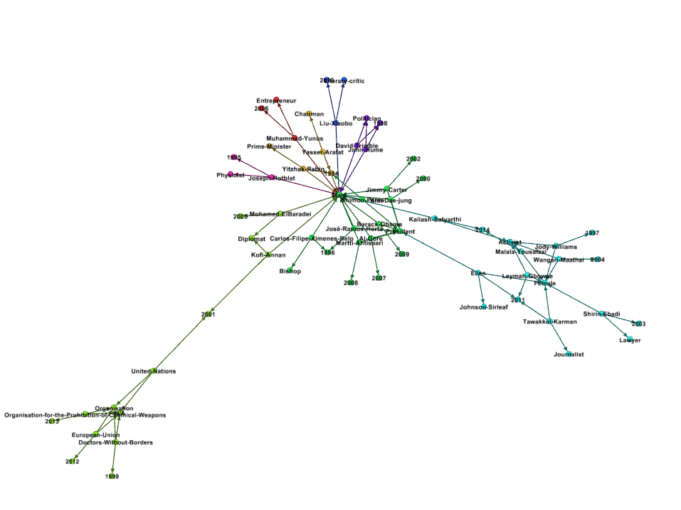
The first try is not quite successful but I did get a piece of how Gephi works. In Palladio and Google Fusion Table, one can only show the relation between two features (source to target). And that gives you the meaning on its appearance: you know what this picture is talking about at the first glance. But in Gephi, it displays everything you imported in at the same time. It looks awful at first since all your features, age/gender/name/place, are mixed together in a disordered picture. What I did to get it work is to delete columns in my data. If I want to see how “gender” and “professions” are associated, which I had done in Palladio, I only keep these two columns in my .csv file. Then in Gephi there is a very clear graph showing all the connections between these two features. So what if I add one more columns? Then Gephi can do things that we could not achieve in Palladio and Google Fusion Table: it shows the connections of the three features. This is not a very complicated graph because we have 3 columns of data imported. But in order to remain the visualization meaningful, we cannot import file with too many columns. Here’s the visualization that I did in Gephi. Note that in Gephi we could choose a way of how these nodes connected to each other: Force Atlas, Yifan Hu, etc. But in Palladio or Google Fusion Table these things are all set ready for you. Also the modular function gives group and colors all the nodes by similarity and difference. I am not sure how exactly it works but I find, in the following picture, that the groups are divided by the degree or similarity in certain features of the nodes. Nodes connected with Male and Female are in two different colors apparently.

I used to think that Palladio is a very beautiful software comparing to Google Fusion Table, but I found Gephi is even stronger in producing good-looking results. The “Preview” page gives wonderful outcomes for the visualization. Gephi is definitely well-developed tool in data visualization but one need to prepare suitable data set to get a good outcome.


For my own data set, the outcomes in Palladio/Google Fusion Table and Gephi are quite similar. One thing different for Gephi is that I did 3 columns data in Gephi, which I cannot achievein the other two platforms. It might be the reason that my data set is too small to fing any significant difference between these tools. But overall I think Gephi is more stronger and I would like to use is for part of my final project since it really provides beautiful pictures.
Leave a Reply