Our research topic is “How president Obama’s speeches changed over the time period from 2008 to 2012”, and we would like to do linguistic analysis on his speeches based on different dimensions including location, time, audience and topic.
Our dataset is created based on the speeches of Black Obama’s speeches from 2008 to 2012. We decided to choose this time period because a lot of events happened during these five years including economic crisis, the election of president, violence of Libya, and others. In the meanwhile, since we want to use Gephi to do the visualization of all the words that Obama used in speeches, five years’ amount of words may be the most suitable one. We first copied and pasted each speech in to individual txt files to create the corpus, and saved them separately based on the years. We also classified each txt file into groups based on locations to do the map, and based on audience to do word usage analysis.
Then we browsed each speech and concluded every single speech’s location, topic, audience, and year. The locations and years are easy to find, but the topics and audiences are not. We found the topics are broad and the audiences are hard to identify during the process of classify speeches. In case of not gathering useful information due to too many categories, we defined topics into groups of Economic, Social, Security, Political and Military. We also defines groups of audience as Public, Student, Military, and Politian.

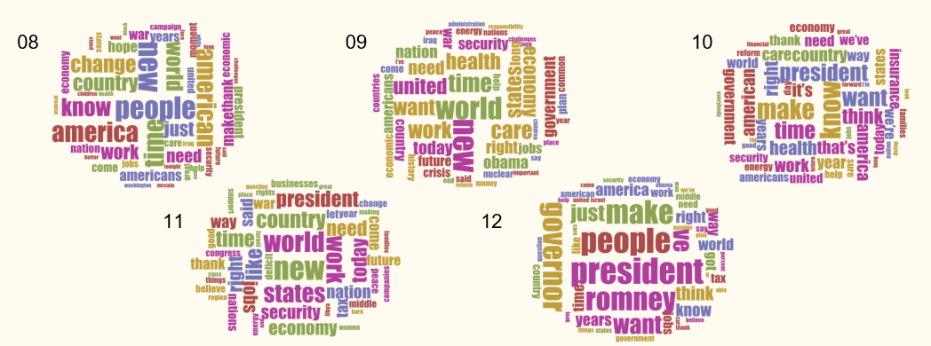
The first analysis we decide to do is the word usage of the speeches with Voyant. We put each year’s corpus into Voyant, and made five word clouds to figure out what the key words are during the five years. Looking at the word clouds we found that there are some clues that show Obama’s speeches are closely relevant the social issues within each year. For example, in the word cloud of 2008 and 2009, we can see words like economy, work, and crisis that related to the economy crisis. In 2011, Obama’s speeches are more about security and rights because of the violence of Libya. In 2012, the election of president takes an important role, so we can see words like president, Romney, and governor.
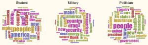
We also did the word clouds of speeches classified by audience. What we found interesting is that Obama’s speeches that are made toward students are mostly about economy. We can see the words “economy” and “financial” appear a lot of times.
Therefore, we did the analysis of relationship between topic and audience using Google Fusion Table. In the visualization we did, Blue dots represent audience, while yellow dots represent topics. If we focus on the blue dot labeled Student, and the yellow dots that have been connected with it. The line that connects student and economic is much stronger than other lines. So we can further prove that when Obama is doing speeches facing students, he will discuss more about economic issues.

In the meanwhile, we count the number of vocabularies Obama used targeting different groups of audience, and found that he used more vocabs when talking to Politicians and students than talking to minority and military. However, there may exist bias in this conclusion because the truth is that there are more speeches toward the first two groups of people, which offers a larger base of vocab usage.

We also used Google Fusion Table to make the map of the locations that Obama made speeches during 2008 to 2012. We found that Obama had never made speeches in Africa and some East Asian countries including China. We found it interesting because it is a little surprise to us that Obama has avoided making speeches in these countries when global networking is much stronger nowadays.

Then we moved our concentration to the speeches made inside U.S. We concluded all the words in different states and use the corpus of words in Voyant to figure out the most frequent word Obama used in each state. We believed that the words that appeared the most times will best represent the relationships between topics and locations. We were inspired by the visualization in the Dubois show, and created the map that is similar to the one Dubois created. To avoid the overlapping of words, we did the states which have more speeches like D.C. first, and disregarded words like people which are the most frequent word in a lot of speeches. To better understand the relationship between location and topic, we used Google Fusion Table to create the chart. In the visualization, blue dots represent location, and yellow dots represent topics. When we looked at the two visualizations together, we found they can be consist with each other. For example, the key word in New York is Romney, and if we take a look at the yellow dot connect with Politic, many of them are cities in New York. That’s because a lot of speeches on the election of president happened in New York in 2012. Despite showing a little relationship between topics and locations, we see the map extremely interesting and attractive because through the words located in the map, we can see some beautiful stories. For example, through the word “Father” located in Indiana, we felt the happiness of president Obama being the father and making the speech as a father.


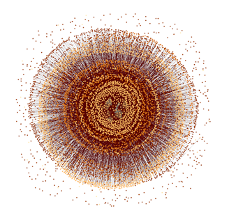
The last visualization we did is the one consist of all the single word. We used Gephi to make the round pattern. The more close to the center of the round, the more frequent the word Obama used. We also used different colors to indicate words used in different years. The degrees of thickness can represent how many words each year used. For example, the thinnest ring belongs to the year 2008 because we only found 4000 words in 2008, compare to the number of more than 60000 words in 2011, the ring of 2008 is hard to see. We also see an interesting element that there are several words has only been used once during five years, and they are located outside the main round pattern.
We created the website (http://jiamingjinboandyifu.co.nf/) including the visualizations we did to show the audience a more organized and clear process of our research on the code-switching strategy that Obama used. Through this project, we think our visualizations somehow solve our research questions on Obama’s speeches. We better understand the using of vocabularies and the choices of topics made by President Obama based on locations and audiences.
Leave a Reply