Project Introduction:
Zhengri Fan and I are always interested in playing RPG games. We love to play RPG games because we like the story behind them. Instead of doing research on games like we did before, this time Zhengri and I decided to directly touch the “base”: hero stories. We would like to focus on relationships between characters in different heroic stories in different time period. From their relationship, we can know each character’s influence to the entire story. Then we categorize different characters according to their gender and camp (protagonist or antogonist) to know an overview of those specific types of characters’ influence to the heroic story. And we would like to explore if different types of character’s influence are changing due to time changing. Our results presentation consist of two parts:
- An interactive website with character visualization and history background: Epic Story Visualization
- An influence dataset collected and processed with graph theory: (On Google Drive shared files, can get accessed from Jiayu Huang, Zhengri Fan or Katherine Faull
Visualization:
Dataset Preparing:
Raw DATA:
The first step of doing this project is to select raw texts of epic stories for further research. Because we would like to find modern English text for better text analysis quality and time periods that can actually influence literature a lot, we choose pre-1850 (God, Royal and Traditional) , 1850-1900 (1st Globalization) , 1900-1950 (World War), 1950-2000(Technology and Coldwar) ,2000+ (Future) as our 5 major time slots to select books. for each time slot, we choose 3 books that can be seen as epic story. The full list of source data can be accessed on our visualization website. We got raw texts from open source library and website, the text files can be found in Google Drive raw dataset.
DATA Preprocessing:
In order t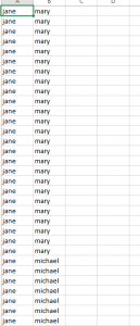 o do visualization of relationship, we need to process the raw text to extract relationships between different characters. So, there are three very important phrases here: raw_text, relationships and characters. we got raw text now, then we need the characters names to help jigsaw do the dark magic trick for us to find relationships. For each book we selected, we created a character database with name, gender and camp (if he/she is good or bad) of each main character in the story. Then, we split our raw text into several small pieces and input them into jigsaw. If two characters appear in one of the smaller piece, we claim that they are related. Because we don’t have super accurate way to let computer understand texts, this is a good approximation to get relationship data. Finally, the relationship dataset is like the picture left: for each line of the csv file, there is an undirectional relationship counted.
Data Processing w/ Gephi:
This time, the process is kind of same like our previous assignment, we do a natural join from our CharacterDB for each raw text and relationship csv file in Gephi. Gephi put character database information into Nodes database and relationship data into edge database. We create data following a commonsense schema: relation-edge and character-nodes. In order to present the character relationship embedded with their influence, we use Gephi’s built-in graph theory analysis tool to get each charactere’s degree (connections between this node to other nodes) , centrality (if this node is the center of this graph: it can be calculated by connected components and degree) and modularity (the strength of the graph that can be divided into different parts). After we apply these tests to our data we find that modularity of relationship of characters in heroic story tends to be really low. That means all of the characters tend to be in one big group. i.e. they all connected in someway. Though, not all of the stories are like this. Paradise Lost’s modularity value is a little bit higher because two camps of characters are separated in a pretty discrete way. After some research on graph theory, we choose to use degree to rank the size of different character nodes. Modularity is a good concept, but it can only represent the grouping but not a good way to measure influence. Centrality, also, is good for determining the “core” in relational web. However, it is not a unbiased representor. It is good in dealing with centralized character. for example, Alice in Alice’s Adventure. But there will be a lot of bias when we are trying to use centrality to determine characters that is not that much centralized in the relationship. In heroic story, Degree and average weighted degree can truly give us a good simulation on the influence level. As a result of this concern, I rank node with different sizes according to different degree number. A character with higher degree can be seen as a more important character. However, I would like to show the fact of grouping and centralization. From visualization concern, I set layout as “Yifan Hu porpotional” with the optimal distance of 1000. This layout shows the fact of grouping (see paradise lost) and centralization very well. Here is a sample screenshot of a character relation visualization: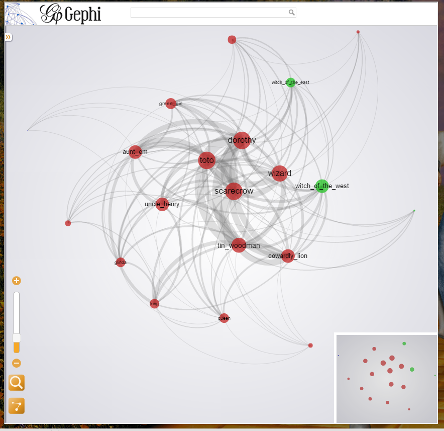
Visualization Utilization/Presenting
On this visualization of “The Wonderful Wizard of Oz”, Dorothy is the centered character with high degree, high centralization. greengirl is a good example of a character with lower influence, either in degree or centralization consideration. Viewer 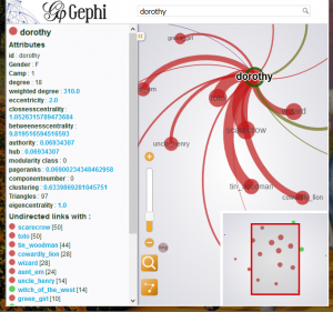 is able to use lower right operator to zoom in and out of the graph. Also, if clicked on one of the node, a very detailed information about the node will be presented, with all collected information about the graph theory and the connected nodes. We decided to keep all of the graph theory analysis data on the visualization because we would like to utilize our visualization not only on current question about influence but also on future potential. As we promised in our previous presentation that the product will be a fully reader driven experience. That we present the data but how to use this relation visualization is due to our user. Of course, we are users ourselves. In order to present our visualization in a natural and fluent way, we use TimelineJS to host our visualizations, for each time period, we have an introduction on the fact on history about that time period on the website and several visualizations on that time period. Then, we have links to our visualization website. On the background, there is a picture for representing the specific time era. Here is a screen shot of our user interface. When designing the interface, we tries different word font and design, and this is the final output that we are really proud to present:

Influence Dataset with graph theory analysis:
Before this section, it is a tool we created to do our research on different types of characters in epic story. This section I would like to talk briefly about how we use this tool to do actual research. This research is based on data we collected above and graph theory.
Step1: Influence Data for different Books
Because we would like to get information about the influence in different time period, before this, we decided to get the influence data on different books first. We export edges list (relationship) and nodes list (characters) from each gephi visualization data set. Then, by using a python script, we traverse th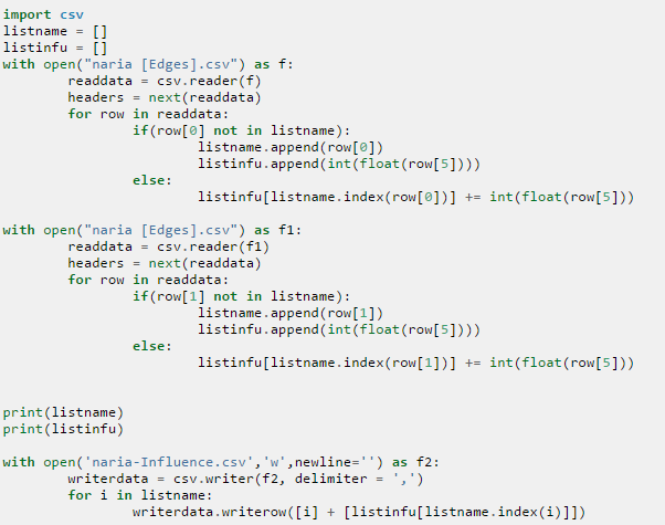 e relationship list and assign the important factor degree to each characters. On the left is the sample source code. The influence data will be calculated and stored in another csv file. However, the influece data we collected here is just:
Number of Connection to specific node
However, if we would like to utilize those data to compare it with each other, a very serious problem occurs: How can we control the bias to data if a book text size is too big. I met this error when I am trying to use influence raw data to do the research. I called it the data bias effect, I will show a screen shot later to show what it is. But now, I would like to talk more about the solution.
Step 2: Standardize Data to utilize data for comparison
There is a concept in statistics called standardization. With this effect data can be processed to e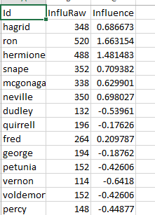 liminate the data bias effect but still have the comparative relationship between the data. It is (X-Average)/StandardDeviation. Therefore, I standardize the influence data for each books. And at last, the right screenshot is a sample data analysis chart for a sample book. Id is the name of character, InluRaw is the unstandardized influence value (The degree). Influence is the standardized version:
Number of Connection to specific node compares to other nodes
Step3: Combine Data from different books to different eras
After we got the data, we will try to combine the numerical variable data with categorical variables. Therefore, we combine the datasets (numerical data) we collected according to different era. Then we combined the connected Character database (categorical data) . The data can be connected harmlessly because they have the same schema. We then use gephi to just do a natural join to join character database and influence datasets according to Id. We then got 5 files (each file for one specific time period). The data in it will b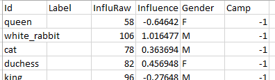 e stored according to the left schema, with categorical data and numerical data connected.
Step4: Compare Data according to different era
Then we use another python script to get information about the overall analysis on different categorical variables with the average influence data calculated (It can be done by simply add because the influence is standardized data). The code can be found in RawConprehensive/Influence Per Era. Then, I created a comprehensive chart as the final analysis on the question I asked.
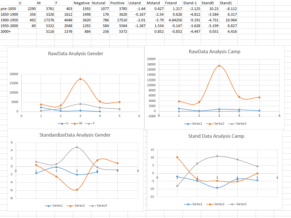
The four graphs are the influence analysis on Gender and Camp. The upper two use raw data and lower two use standardized data. The significant peaks on raw data analysis is a good example of data bias effect. Because of the significant length of The Lord of Rings, raw data is not trust-able in concerning with data-stabilization. On the Standardized data, we are not researching the effect of all characters of certain type to the story, but the average influence of this type’s instance. For example, we are not trying to explore the influence of Jenny + Herimone +… ‘s female’s influence to Harry Potter but their average influence. We are trying to know the singleton’s influence in the story. On the first graph we can see woman’s influence to the story raises significantly in 1900-1950 time era. This raise means a woman in the story might be more influential than a man in that story. From our previous research on war, that war comes with love, always. It might be the same effect, in a period of war time, people want get comfort from female character. Then, although there are woman right movements from 1950s-2000s, man’s position become more important in epic stories. And It is the first time man’s influence in the story is higher than woman’s. There might be an explanation to this that the data is an average value, there is not much woman characters before, so each one of them will be super important to the story. However, with more woman right concern, we have more woman in the story, so in average, they are not that much important. Those 2 are just my justification/explanation on my data observation. At least we can get a very clear pattern on the graph, that when man gets more influence, woman gets less. On other hand, if we take a look on Camp dataset, we will see a very blur pattern from the data, no significant peaks and no very much correlation. I will talk about this in my next section.
Success and Failure on Our Project:
Success:
- We successfully get the woman’s influence on the book correlated to time. and it is correlated to man’s influence
- We successfully get a relation graph for future research/use
- Our design is awesome
- Our data analysis part is very strict and convincing (in graph theory).
Failure:
- Our dataset is too big, we are unable to do very deep analysis (Maybe analysis on story plot) due to this issue. We find it is a problem too late
- Our camp-analysis fails. There is a reason that we can not easily divide characters in one book into simply good, bad and nutural. We need to use a better categorized factor. Then It might be an issue in our assumption making period.
Leave a Reply