Introduction
As an enthusiastic in video games, we have done several projects that are directly or indirectly related to the video games, especially RPG games with the fact that RPG games tends to have interesting plots than other kinds of video games. For the final project, based on our interests in RPG games, we are more willing to discover a little deeper on this sort of topic: as most RPG games are talking an epic story with the media of video gaming, we are going to figure out how epic stories changes over time. By making relational graphs over the epic stories with attributes like genders and camps (Or, the “role” they are playing in the plot, either protagonist or antagonist). We are going to explore how factors changes over time, or trying to see if any generalizations can be made based on the visualizations. The result of our exploration would consists two parts:
- A website which contains interactive visualizations and some historic background
- An datasheet that applies graph theories to our data (Shared using google drive)
Data Collection and analysis
Row Data Collection:
The very first thing to do for our final project is to collect raw data for future processing. Fortunately all of the books that we are desired to measure have a modern English translation, therefore we could use the text analysis software that we are familiar with. The way we are organizing our data is to group them into five different time periods, which are: pre-1850, 1900-1950, 1950-2000, 2000-present, and then, we start choosing books that are published in each periods. We decided to do three books per period; for detail, the website has all the names of the books we are using there. Then, after seeking the raw texts from internet, we apply further mechanism to make the raw text useful, and there comes our magic tool: jigsaw. We use jigsaw for analyzing the frequency of connections in different texts, and export them to csv spreadsheets which looks like this:
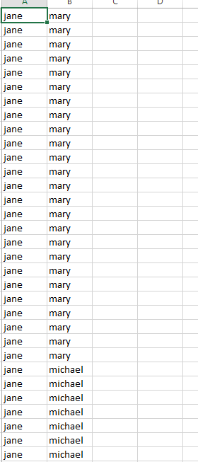
in which we have the names of the characters in one line, and repeat them n times in the sheet, in which n is how many connections they have that is analyzed using jigsaw. We decided that for pairs of character, they are connected if they coexists in a small portion of text. Although this would not be very accurate, it is a good approximation for general relational analysis.
After our relational csv file is done, we starts to make characters’ attributes. The attributes including the gender and the goodness(whether is playing against the good wills in the story or not) of the character, and make them into a csv sheet.
Data Processing Using Gephi
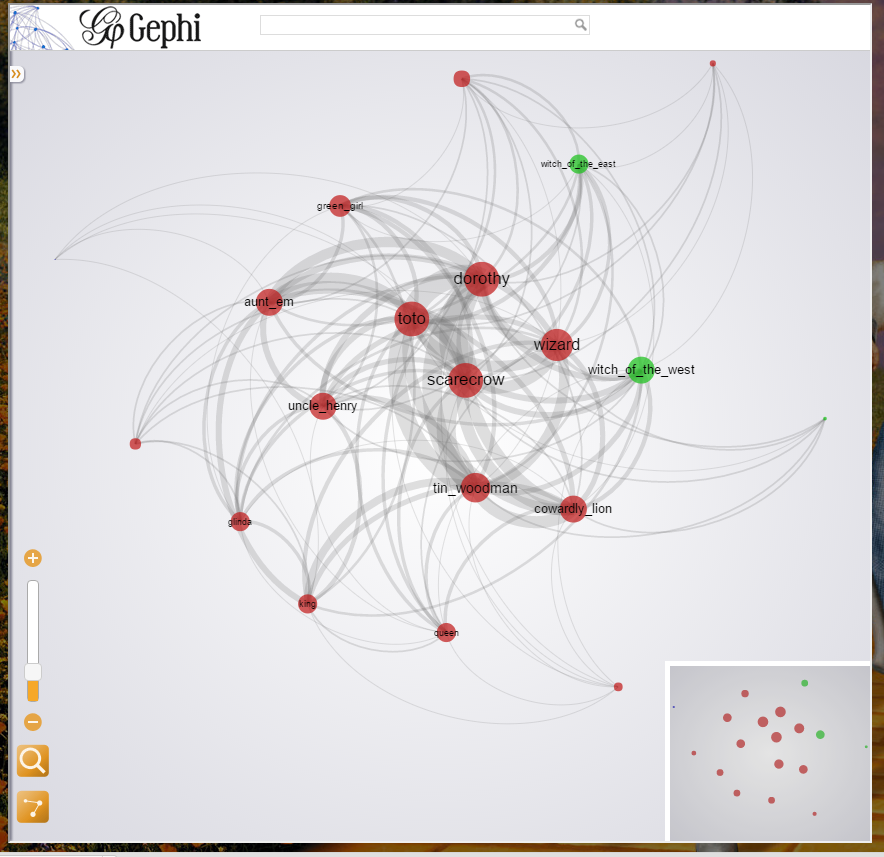
With the powerful platform Gephi, we are going to further polish our data. Since we have the connections data and attribute data in separate file, we are using Gephi to perform a natural join to make the two separate data merge together. Therefore, each characters in the Gephi data would contain both the attributes and the connections in it. We following the common relation-edge and character-nodes schema, and uses the Gephi built-in methods for analyzing the influences with graph theories, which includes the degrees, the centrality and the modularity of each character. After processing with respects to each pervious variables, we found out that the modularity is relatively low with our data set, means that each individual characters are connected all together in someway, with little exception like the Paradise Lost, in which the modularity value is somehow higher than other stories. That is predictable since in the actual story, the goods and the bads are somehow separated. By our knowledge of graph theory, we decided to use degree to rank the nodes of the characters. The reason why we are not choosing the modularity as the size factor of the nodes is that it is not an unbiased variable, as well as it is not a very good way to represent influence, or, not direct in measuring influences. Therefore, we choose degree and the average weighted degrees as the main factor for ranking different nodes. For grouping the nodes in the final visualization, we then decided to use the centralization to group the nodes. In the visualization setup, we used “Yifan Hu proportional” with the optimal distance of 1000. The following picture shows the general appearance of our visualization, and shows that grouping using centralization is a good idea.
(The Wonderful Wizard of Oz Character visualization)
Data Visualization and Its Presentation
We choose the pervious visualization with detail as the illustration of our visualizations. 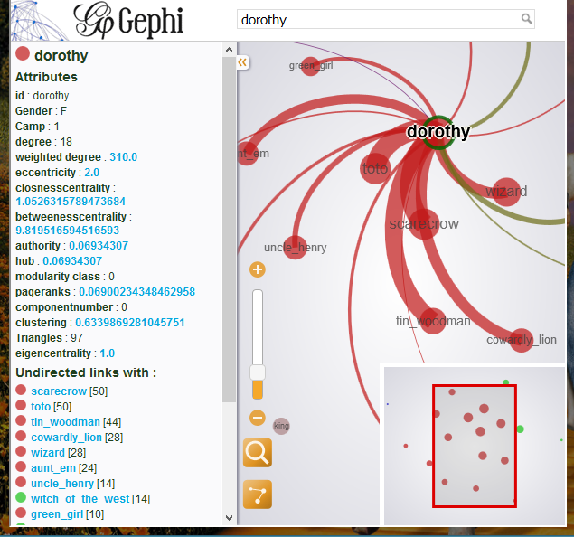
We could see that Dorothy, which is the view point of the story, shows the most connections and centralization in the whole visualization. We could also see that the green girl, which is located in the top left corner in the left figure, shows a character with low degree of connection and a low centralization, which means this character does not have much influence over the whole story. This screenshot is taken when the user clicked on the node that represents the character Dorothy, and as a result, a very detailed information including the statics of the character is displayed on the left of the screen. Of course the user could click any of the nodes and get the same kinds of information for different nodes/characters. This might be considered as overly informed to the user, however we decide to keep them in order for people to conclude their own answers to their or our questions when exploring our website, as a good reader-driven visualization there. To group all our visualizations in a meaningful way, we choose the timeline JS platform to gather them on a uniform timeline, and put the five periods into the it. For each time period, we first gives the user a historical background in quotes and provides links to each visualization that we made. We also highlighted a visualization for each period so that the user could directly interact with it.
(Screen shot of our website)

Influence Dataset with Graph Theory Analysis
We developed a method for analyzing different types of characters in epic stories. I would introduce this method at the beginning of this section. We used the same dataset to perform this analysis.
Step1: Influence data with respect to each book
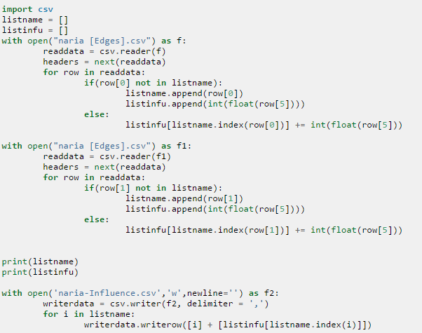
Based on our research objective, we decided to get the influence data on each books first. Using a python script, we traverse over the relational and the character sheets, and assign the important factor degree to each characters. The following is the screenshot of part of our script. The influence data is calculated using the script and stores in a separate file.
We know that different books have different sizes; generally, a foot thick book would provide a larger number of connections between characters than a inch thick book. To utilize the data and to compare the characters of different books with each other, we standardized the data to perform comparison.
Step2: Standardize Data
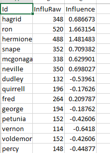
In statistics, there is a concept called standardization, in which is a proper solution to the size problem of the books. By using a factor of the (X-Average)/StdDev, the influence data of each book is standardized. The following screen shot shows a piece of the data we collected and processed, in which id is the name of the character, InfluRaw is the unstandardized data and the Influence column is the standardized data, in which it represents the number of connections compared to other characters.
Stpe3: Combine Data Altogether
After we standardized data, we are going to combine them together. Therefore, we merged the numerical data collected before and the categorical raw data from different time periods 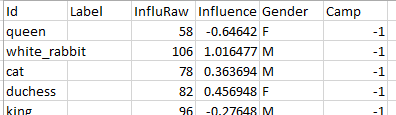 together. Since they have a common name associate with them, it is an easy combination by using Gephi’s natural join utility. As we see from the right, we connected the attributes of the characters and their numerical influential data that we made previously.
Step4: Compare data from different era
By using another python script, we got the overall count of the of different categorical data and the average influential value per era. By grouping them into a comprehensive spreadsheet, we could perform one final analysis.
(Raw data and plots)
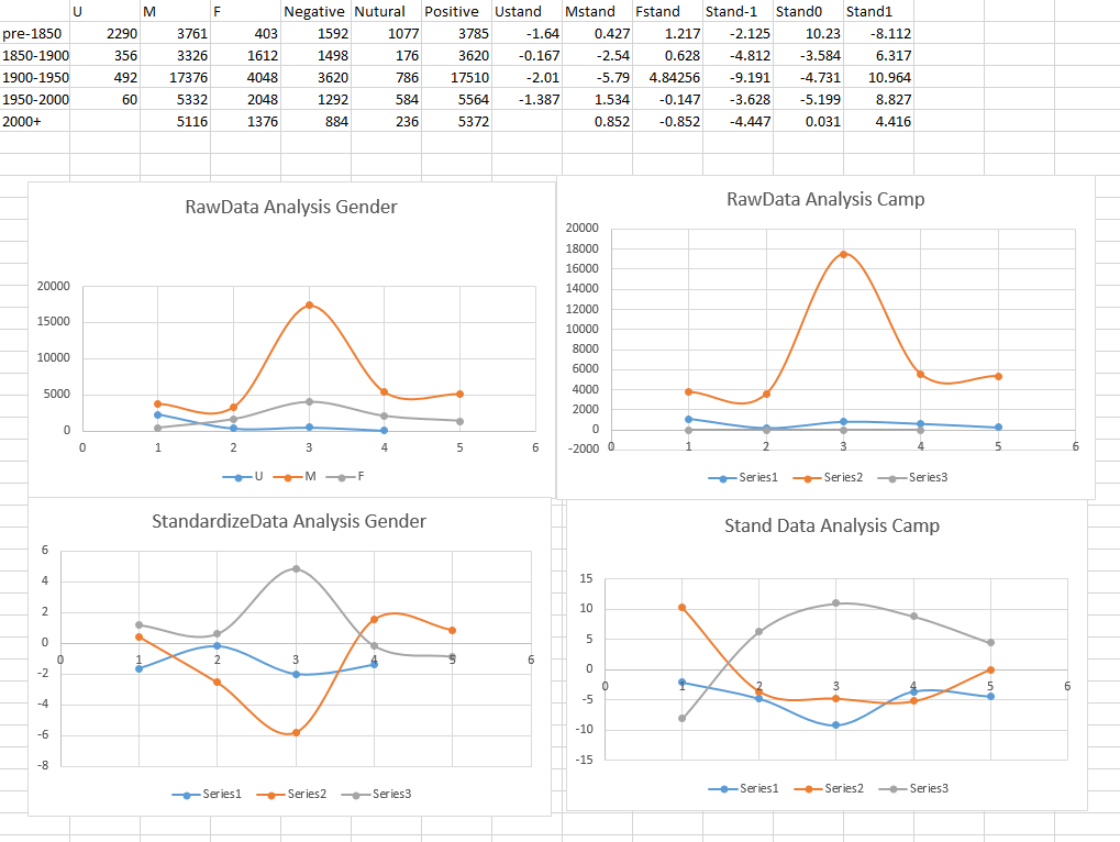
For pervious plots, the top two are the plots based on the raw data, whereas the bottom ones are based on the standardized data. As we can clearly see there, simply using the raw data could clearly generate a very different result, and it also shows the influence on the size of the books. For the standardized plots, as mentioned, are representing the average influence of each types of character. We are not analyzing specific characters but rather their types, which includes their gender and the goodness of the character.
As we could see, for the gender analysis, the women’s influences (the gray line) significantly increased in 1900-1950 era, which may corresponds to the wars at that time, in which people find women figures are more attracting. Interestingly, although the famous Feminist movement is happened in the 1950-2000 era, the women’s influence is dramatically decreased, and the males’ influences(the orange line) dramatically increased, and is the first time that the men’s influence rule over the women’s. It might because more women figure exists in the story and making the average influence decrease. Unfortunately, we could not see any influential trends in the camp data, which is clearly one failure of our project and I’ll talk about it in the next session.
Success and Failure
Successes:
- It seems that the gender’s trend plot is a meaningful one. We could expand that topic and do some more researches to reveal more facts.
- A clear relational visualization, and have potential for future uses.
- Website, thanks to the timeline JS platform, is visually rich.
- Applied graph theory and generated good results on our visualization.
- Big dataset, and we even plans to do five books per period, which makes us unable to dig more into the data (even if we used three books per period).
- The “goodness” analysis is not showing a clear trend, which one problem that dividing a character into either black or white is pretty difficult, as each character might show two conflicting characteristics in the book. Maybe we need to come up with a better division method; maybe not, it could also be the problem that we only uses three books per period; although that is a good amount of work for us, it is not that representative overall. Or, it might be the problem for our period division; maybe 50-year division doesn’t correspond the development of the epic stories.
Leave a Reply