Our final project is called “Poker face” and it is a analytical research on Obama’s speeches between 2008-2012. Jiaming and Jinbo were both very helpful and thoughtful during the whole process of our final project.
- The Start
Our first question that attracted us to this field of study was “How does a president speaks when in different situation?” We thought it would be very interesting and meaningful to look at the speeches given based on divergent outside situations. Later at the advice from Professor Faull, we decided to also put effort on the topics that has been talked about in the world by President Obama.
- The Corpus
The corpus consists of almost 200 speeches from the five years from 2008 to 2012. The first thing that we wanted to know about these single speeches is the categories that each of them belongs to. According to the general question that we come up at the beginning, each speech is assigned a time, a place, a topic and an audience. Thus we could sort the 200 speeches into a .csv file and do research and analysis that we wanted to do. This is the most time-consuming process: it almost took our three two weeks to read through every speech and categorize each speech into the right place. There are some very clear figures that we could find as we eventually finished the file. Almost half of the speech took place in D.C. where the white house located. And the most frequent word used in speeches to students and commencement is “education” and the second most frequent ones are “job” and “economy”. These are quite interesting observations before we dig more into the data. What is the purpose that Obama give speeches to high school student and graduates? To use their educational experience to find good job and make the U.S. economy better, isn’t it?
After we finished the excel sheet, the next step to work on the set of data is to categorize the corpus one by one. We created several folders and sort these 200 speeches by time, places and audiences for further research. It is even more amazing that we did another spreadsheet for Gephi and it contains every single word that Obama has used in these five years(it is nearly 70,000 lines).
- The First Step
We followed the sequence of the our course study in the usage of the software and platforms and we tried to see if everything would give us something useful or meaningful. So the first step is the powerful word analysis tool-Voyant. The best of Voyant is that the word cloud part is really clear and easily changeable. As our interests, we put the sorted text into Voyant. As the following picture shows, it is very clear that each one is different. In 2012 the word “Romney” made a huge part which refers to the election of the year. And when the texts were sorted by audiences, they show that Obama literally talks different things to different people. One could be able to guess which one refers to which audience group even if I erase the labels.

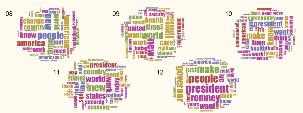
One more interesting finding is the total word usage.

According to the data above, Obama used more than double amount of the words when talking to Politicians than Military. It is reasonable to conclude that the writer behind Obama’s speeches must have thought about how to make the speech more useful. In fact, we all have the experience that it is necessary to say one thing in different ways when we are talking to different people. So we could see the speech strategy and construction really cares about whom the speech is given.
- The Map
Another very important part of our project is the map. We got the inspiration of denoting one place with a certain word in the DuBois exhibition early this semester. We all think that this will be an attractive thing to the readers about our project. As the following pics show, each place or country that Obama has visited and gave speeches was assigned a word.


The word/world map is a real representative of the speeches geographically. The most useful way to interpret this map is the how the place/country is connected with American politics and economy. It is reasonable to see that words like “Nuclear” appears on Moscow and “Security” appears on Afghanistan. There are also “partnership” on Australia and “Democracy” on Brazil which are not listed on the map above.
During the process of making this map, I first ranked all the places and countries in a decreasing order according to the number of speeches took place so that I could decide that big/important words goes to the matching place. Then I put the texts sorted by places into Voyant and look for the most frequent word. Later when I do the same thing along the rank list, I avoided using repeated words so that the map looks more meaningful. I also disregarded the most common words like “American” and “People”.
- Relationships

Other than words analysis, out interests also contains the possible relationship between his speeches. The visualization above is the relationship between places and topics in Google fusion table. The biggest D.C. is in the middle for sure and almost all of the topics (yellow nodes) are around. Also we could see that the Religious topic was only talked about twice in these five years. This visualization is interactive on our website. One can drag those points to see the relationship.
- World of Word
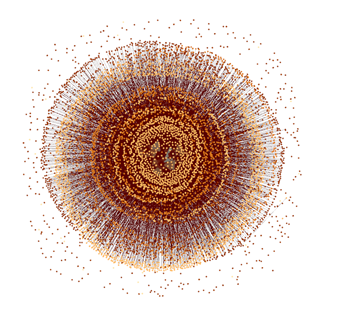
This might be the most complex and beautiful visualization that we have done so far. In my own mind, Gephi is the strongest tool in data visualization but I have not make full use of all the functions. In this 10,000 nodes graph, it shows all the words that have been used in the five years. It looks like a tree ring and several rings can be seen. There are five rings in total if we do not consider those scattered points outside the graph, which refers to those words only appeared once. And each of the five rings represents words have been put in use in a certain year.
- Conclusion
I like this topic very much and we put in much effort as a group in this final project. I think we could do much more things with the corpus available. The sentimental in Jigsaw and timeline in Palladio combined together would be a good try but we do not have enough time to do everything. Also the visualization in Gephi could definitely be analyzed with more details.
Leave a Reply