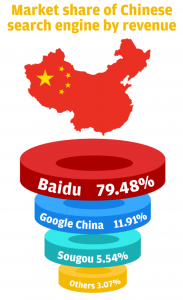
#1 This Visualization apparently agree with the very conservative Chinese media’s opinion that China is slowly eroding by the new Internet culture. The choice of visualization picture and theme is very important. The author of this picture may just want to present users the market share comparison but the picture gives us a really bad feeling. Then, what makes it even worse is that the size of those ugly rings don’t actually reflect the percentages written. Math also matters!
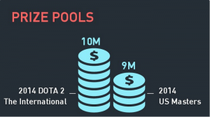
 Well, It really impress me that 9*2 = 10. Data Visualization is cool and looks reasonable. That’s why many company uses it to “tell the truth”. But some times, THE truth bias our universe law. Do Math First.
Leave a Reply