This bar chart looks really confusing to readers since its proportion between the height and the numbers. 2.49 billion looks similar to 16 billion and 1.05 billion is on the same height as 10 billion. More than the proportion misunderstanding, this chart should have put different years and countries under comparison. But the author chose to made a round background and put all the statistics separately, which makes it even more confusing.
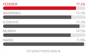
This one is even a more stupid viz. At first I was wondering why a statistic in the middle range would become highlighted, later I realized that 77.1% is the highest number among all of them. The least one Nadal seems to be the highest one, almost reaches to 100%. The numbers and their shaded areas are so out of connection.


Leave a Reply