As with Assignment 3, I utilized the CHILDES corpus of child speech in order to create the data-sets used in my visualizations displayed below. As before, the data I pooled from had already been separated into categories based off of the syntactical level of the speaker. The specific pool I utilized was from children of the lowest level of capability (and thus, age as well). Getting the extra information required for my visualizations consisted of parsing through the original data and organizing it into sets based off of vocab use, age, and gender. Due to the unorganized structure of the CHILDES corpus (there being only loose structural guidelines for it, with few contributors actually making use of all the data tags supplied) getting this information together didn’t prove easy, but ended up being quite fruitful.
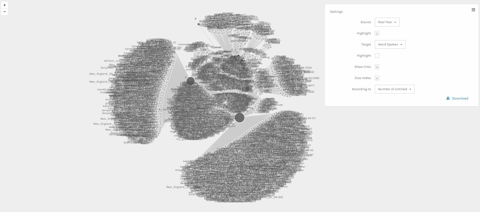
This first visualization was created utilizing the Palladio platform and resulted in an immediately interesting (if complicated) visualization of age versus vocabulary use. As can be observed above, the largest number of utterances came from those who were 1 or 2 years old (as represented by the larger nodes on either side of the central structure). Though there are a good amount of words connecting these two age sets, as well as to the other ages at the top of the central section, the truly interesting thing about this data depiction is just how many words are not connected by common usage among age groups (as shown by the large clusters of nodes on the proximity of the visualization). But, due to the fact that Palladio has trouble with this much data, as well as the sheer amount of it, trying to inspect it closely proves difficult, if not impossible. This is still a much more interesting visualization than the ones that I was able to create using Google Fusion Tables, which were structurally unclear and muddied, but nonetheless this picture still leaves something wanting.
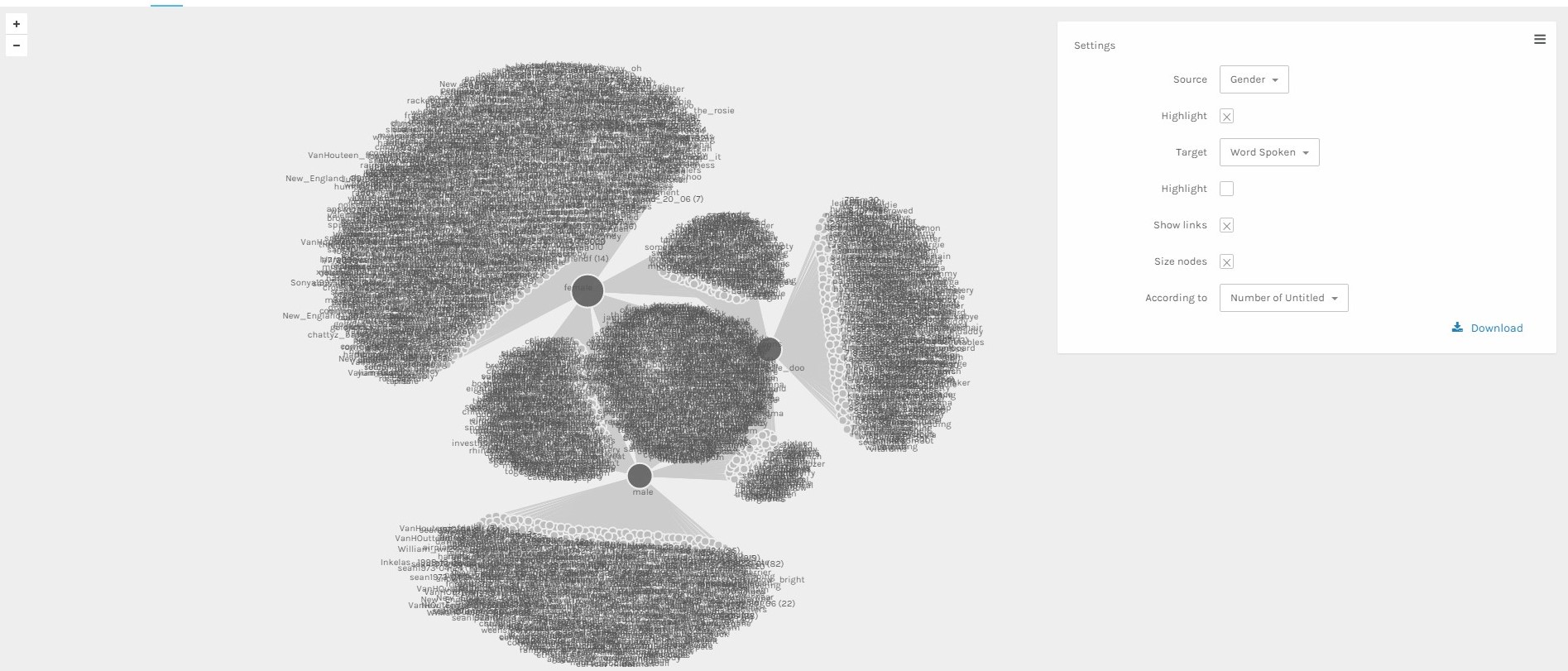
This second visualization, depicting the correlation between spoken vocabulary and gender, is immediately more interesting than the previous one due to its clarity in relationship between each subsection. The structure of the visual is as intriguing as it is logical. The three large nodes with a majority of connections represent Male, Female, and Unspecified genders. Each are connected to each other as well as having their own collection of unique words not shared with the others. What is interesting about this is just how many more unique words the Female gender has than the others. But, even though there are a lot clearer conclusions to be drawn from this visual, it’s still lacking in the way of interaction and close inspection.
This is where Gephi comes in.
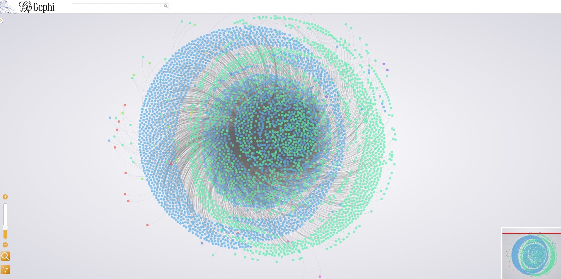
The above picture is a static image of a visualization of the same age versus spoken word data used in the first Palladio visual. While it is readily apparent just from this still alone how much cleaner the Gephi visual is to its Palladio counterpart, I suggest that you follow this link (Age vs Word Visualization) that will take you to an interactive version of this visual to see the true power of a Gephi visualization.
This interactive visualization was created by first making the graph of connections in Gephi, and then loading into the Gexf-JS Web Viewer program created specifically for viewing interactive Gephi visualizations online. I originally tried using the Sigma JS exporter instead, but the platform was unable to handle the size of my data set. Gexf-JS gives many of the same interactive benefits of Sigma JS, while also being a bit cleaner in its search interface as well as its responsiveness and drawing capabilities.
This interactivity gives a user the ability to not only see overall connections and structure of a network, but also the individual connections between items in the network itself. Nodes are colored based off of the connection grouping that they are most affiliated with. For instance, the word “write” was most used by those of 1 year of age and is colored blue, while “next” is green because it’s mostly connected to the 2 years old age group. From there, the visual is structured by the Fruchterman Reingold layout, meaning that nodes with more connections are centrally located and those along the perimeter are the least connected. As can be seen with the age visualization, this leads to some very interesting layouts which can tell a user a lot more about a set of data than Palladio was able to, especially in the case of a large data set that is as hard to read statically as this one. But, once you play around with the visual for a little bit, you can make some interesting conclusions about word use and overall connectivity than you might be able to make otherwise. As well, this is all for a visualization which is inherently muddied in structure. When you get something more structured, things get even more interesting.
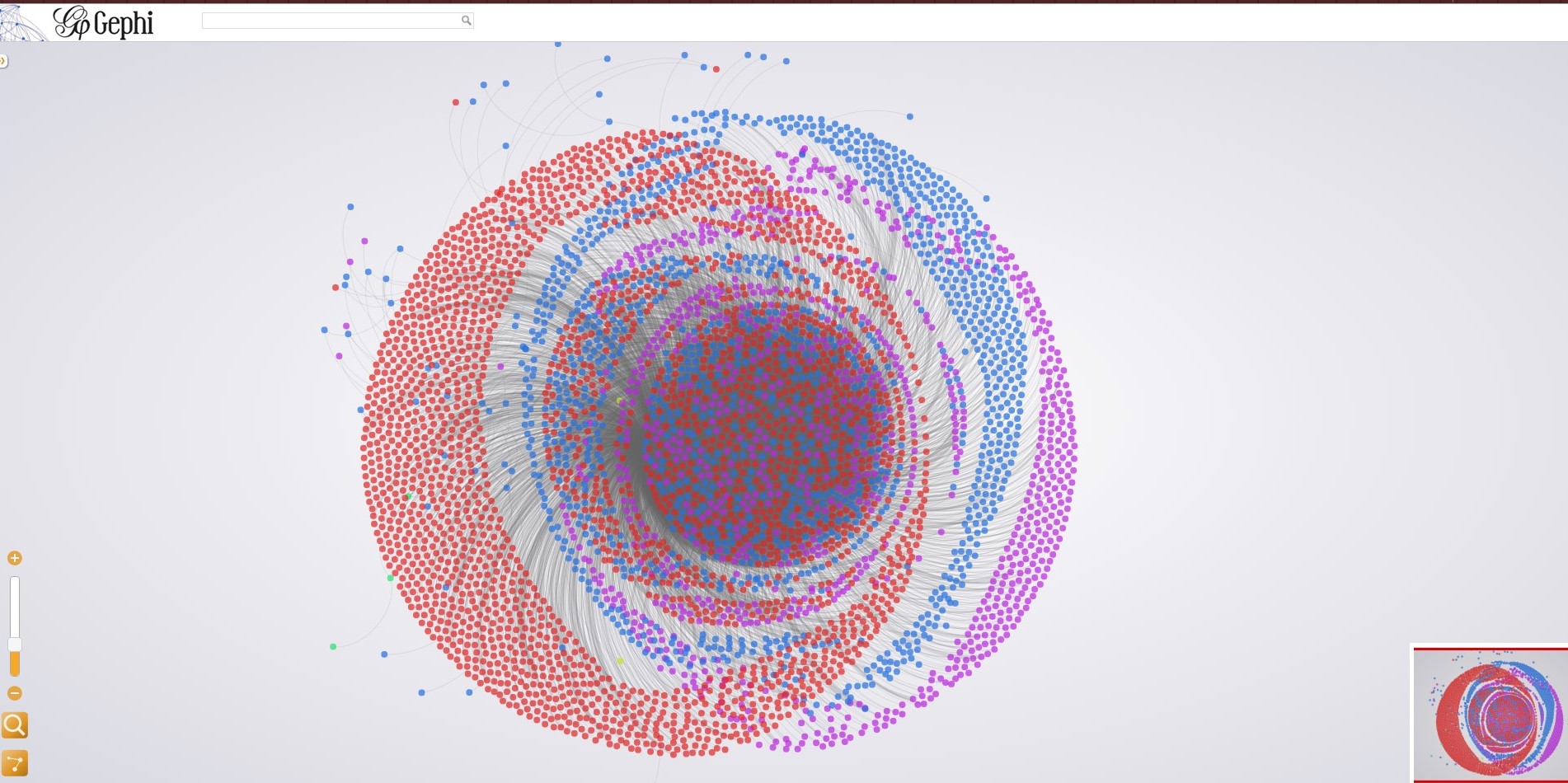
This above picture shows a static version of the interactive visualization which can be found at the following link (Gender vs Word Visualization). In the visualization, red is associated with Female, blue Male, and purple is Unspecified genders. While this may be somewhat similar to the visualization made via Palladio, it’s ability to display the centrality of nodes, and even the overlapping connections of each gender group, are made much more readily apparent. We see a lot of overlap between Unspecified and female (which may suggest that this data may have been spoken by female children) as well as strong central connections between all groups. This layout makes this exploration much easier, as well as allowing for much clearer conclusions as well.
Overall, I would have to say that my visualizations with Gephi (especially after exported to a web interface allowing for interactivity) are far superior to those created using Palladio. While Palladio did a good job with showing the degree of node connections with the sets being studied, organizing the data so it centered around the subsections being measured, these structures didn’t allow for much exploration or even insight beyond the top-layer of general connectivity. The Gephi visuals not only are easier on the eyes, but also give the degree of each individual word once selected, as well as all connectivity and the relative orderings between each node. So while the general eigenvector may have been comparably similar, what each platform was able to say was drastically different.
This whole process, from data collection, to database construction, to platform testing, has shown just how important iterative design can be. While Gephi is definitely my platform of choice for my data, if I hadn’t done the work prior of testing the data on other platforms, not only would I have had nothing to compare it to, but I also wouldn’t have had as strong a grasp on my data itself. I believe Lima would have supported this process and even actively encouraged it. After all, it helped produce a visualization which not only looks good in its own right, showing some general conclusions about my data sets, but also allows for the user to go out and discover their own conclusions. Because, at the end of the day, visualizations mean nothing without context. So giving the viewer the keys to their own conclusions opens up a new realm of discoveries, even beyond what the original creator could have imagined.
Leave a Reply