For this assignment, I once again chose to visualize Bucknell’s database of course information for the Fall of 2015, so that I can most effectively compare Gephi to Google Fusion Tables. I modified my original dataset to work in Gephi by creating a CSV file containing nodes and a corresponding edges file to draw 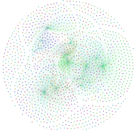 directed edges between the nodes. Courses and (College Core Curriculum) CCC requirements are represented by nodes and edges are drawn from a course node to a requirement node. This involved algorithmically generating the edge list to link nodes, which Google Fusion Tables did for me automatically. Although there was additional overhead to develop input data that is suitable to Gephi, it came with the added benefit to having directed edges and the ability for me to specify weight to each edge (which I chose to be the number of sections of a course that fills the requirement). I chose to run the Früchtermann Rheingold algorithm on my data because Force-Atlas created a large clump in the center due to the CCC nodes being heavily linked to other nodes.
 After partitioning the nodes by department, running the Modularity analysis on my graph, and reducing the edge size, I was able to create a very attractive visualization. The Früchtermann Rheingold algorithm placed courses that do not meet any CCC requirements around the outer edge and beautifully interweaved the remaining data in the center of the graph. The center consists of clusters of high-degree CCC nodes with large numbers of course nodes directed toward them. Due to the structure of my input data, the CCC nodes with the highest degree are also the nodes with largest betweenness s
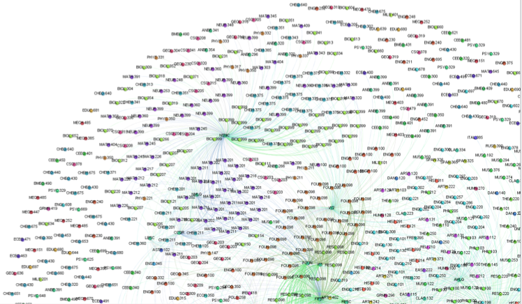 ince every edge comes from a course node and ends at a CCC node, which results in the maximum path length being one. The eigenvector yields a similar result, as my input data is not complex enough to yield insight beyond in-degree and out-degree. In future iterations, I plan on modifying the input data to visualize these useful metrics.
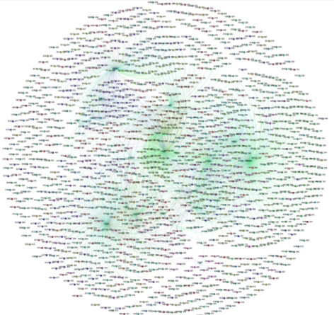
After turning on labels for nodes, the aesthetic appeal is reduced dramatically because unlike Google Fusion Tables, Gephi does not selectively label nodes based on their size. Google Fusion Tables is able to dynamically resize labels and toggle their visibility based on your zoom level. Overall, although Gephi was able to create a more aesthetically pleasing visualization, I found that Google Fusion Tables made it easier to explore the data and its connections, especially with its filtering abilities. However, I believe I can create a more functional Gephi visualization with some modification to the input data so that I can better make use of the software’s advanced analysis tools. I would like find ways to resize nodes and distinguish CCC nodes from course nodes, which I was able to implement in Google Fusion Tables. One downside I experienced with Google Fusion Tables was that it would automatically hide nodes it deemed to be insignificant, as a way to provide a more organized view of the data. Gephi offers the modularity to keep all nodes and reorganize them as needed.
I believe that this visualization meets some of Lima’s requirements for networks. This is a new, unique visualization since we typically see course data in a table view, so it creates the potential to generate new insights into the Bucknell curriculum. The graph clarifies our understanding of relationships between nodes by drawing the relevant edges, color coding nodes by department, and using network algorithms 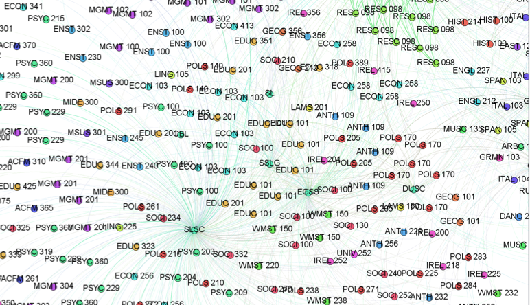 such as Früchtermann Rheingold to create organized clusters of nodes. These graph makes it easy for people to see the outliers around the outer edge as well as the high degree nodes in the center. Both types of nodes can have high levels of significance, so it helps that Gephi keeps all nodes in the visualization, even if they may not seem important. I did not find that this visualization greatly expanded my knowledge on the data, since it mostly provides similar information to what was already discovered in preview network graphs of the data. On the other hand, Gephi does a fantastic job of creating aesthetically pleasing visualizations that look like art. I’m excited to expand on my work and create more complex graphs that unlock additional insight to my data.
Leave a Reply