According to Lima, network visualization must start with a question. For this assignment, I reverted to studying Elizabeth Warren. Specifically, I sought to compare the text analysis data I gathered from Assignment 2 to her Facebook page likes. Through a comparative analysis, I hoped to discover a relationship between the speeches relayed to her audience, and what types of organizations it drew to liking her Facebook page. Google Fusion Tables and Gephi were the two platforms I used to analyze her Facebook likes. After several attempts, Palladio would never upload my dataset. However, I can imagine the product being similar to the first visualization Gephi produces when I upload my dataset. Clearly, Gephi is superior because of the several ways it allows you to visualize the graph in different ways (layout, size of nodes, centrality, degree, color, etc.)
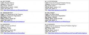
GoogleFusion Tables is very useful in that it is excellent at summarizing and inputting large amounts of data into rows similar to excel, or a unique feature, “cards.” I found the cards to be the most useful aspect of Fusion Tables when analyzing the Senator’s Facebook likes. In fact, it reminded me of a baseball card, a summarization of a players statistics, team, batting average, etc. Below is a screenshot of the cards feature”
As visualized, the card includes absolutely everything you need to know about each node in the Gephi visualization that pertain to this dataset. It is important to know the name of the node and the industry or organization it belongs to, as it allows the audience to see what type of audiences the Senator attracts. In addition, one can see how many likes the node/page that has liked Senator Warren’s Facebook page has, allowing the reader to see how popular that page is. The cards feature is a great introduction to what Gephi will visualize.
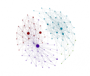
Each node represents a Facebook page that has liked Senator Warren’s Facebook page. As of today, the Senator has 1,649,577 likes. The beginning stages of my data visualization:
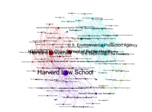
I selected the Fruchterman Reingold layout as it is most appealing to the human eye, and appropriate for this dataset. Lima states, “ the aim is not to merely create an algorithm capable of sustaining copious amounts of nodes and links. But also to select the most appropriate scheme based on well-founded design principles and appropriate interactive methods,” (Lima 95). In conjunction with his comments, to analyze particular nodes, communities, and generally make the visualization more informative, I ran a series of tests, including ranking nodes by degree, color, modularity, average path length, size, adding labels, and filtering out nodes that the repulsion strength of the visualization deemed they were outliers. These outliers have the highest eccentricity. The totality of all of these configurations resulted in the graph below:
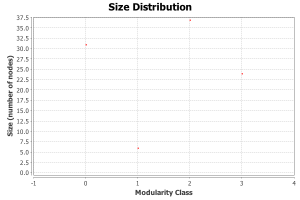
The larger the nodes, the more connected they are to other nodes. In other words, the largest nodes have been liked most by other Facebook pages that have also liked Elizabeth Warren. The five largest nodes, to no surprise, are Harvard Law School, where the Senator served as a professor, Harvard University, Harvard T.H. Chan School of Public Health, EPA, and the Department of State. There are three large communities, colored red, purple, and green; and one small community, called teal. The communities represent Facebook pages that have liked each other the most. Colored communities allow the human eye to easily interpret which groups are most connected. Based on the visualization, the follow statistics have been obtained: 37.63% of Facebook pages that have liked Senator Warren’s page are government organizations; 12.9% Education related organizations; 11.83% Non-profit; 7.53% Universities. When I filtered out the nodes that are least connected to other nodes (TV Networks 1.08% and Books 1.8%) it made the visualization more intact. By clicking on the average degree, one can see which node has the most likes. The final product, according to Lima, “should always be a useful depiction able to fulfill its most fundamental promise of communicating relevant information,” (95).
I’ve learned that Gephi is a great platform to create network visualizations with two or three categories. After that, it get’s very tricky and frustrating. In the future, if possible, it could be interesting to compare the Senator’s top donors, the industry they belong to, and the number of likes those respective industries have on her Facebook page.

Leave a Reply