1.
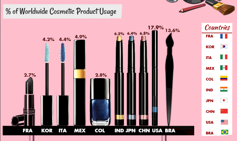
The pink color and the usage of cosmetics make the visualization look attractive. However, the sizes of these cosmetics do not show the relevance among the data; and the percentages are not well arranged. The percentages of IND, JPN and CHN are different, but the cosmetics which represent them are exactly the same. the 17.9%(USA) is just a little bit taller than 4.9%(MEX). The country flags seem to be irrelevant because there are already country labels under the cosmetics.
2.
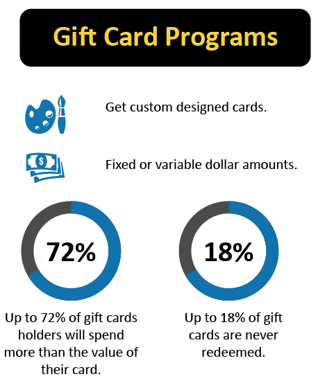
This visualization uses two rings to indicate one comparison, which confuses me. the blue and grey color seem irrelevant to the data, but actually represents the percentages. It will be better if there is only one pie chart labeled the texts and percentages.
Leave a Reply