After we’ve learned how to visualize networks using two different tools: Google Fusion Table and Palladio. After all, both are very good tools. They both provided useful ways to do the visualization, despite the fact that they perform and feel differently with each other.
Instead of visualizing plain texts, both Palladio and Google Fusion Table using csv spreadsheets as raw data input. In some sense, those raw data are more solid in a way that those spread sheets may only contain facts; unlike essays, blog posts, etc., it would and should provide a more predictable result instead of the possible surprises that text analysis may provide. And interestingly, Voyant and Jigsaw are local software while Palladio and Fusion Table are applications that based on a browser, so it seems that network visualizing software need networks :D.
Raw data collection:
Ignoring the fact that different people may feel differently based on the fact that one have to build their own csv file to work with those tools, they are very interesting tools for network visualization, especially they have maps build-in, and that’s why we choose to step out of our RPG analysis previously since they have limited location associated with them. What we finally decided to visualize is the warfare that happens between 1900 and 1950, in which the two most famous ways lies in the period: WWI and WWII. What we have in our data includes: start time, end time, name, the country involved, and the result(indicating who won the war and who lost it).
Palladio, a Beautiful Platform with Potential:
First thing first, different from what my partner’s value (and him being a Google fanboy), I think the beauty of a tool should be valued more than it is valued currently, especially for a humanity tool; after all, I cannot believe that a tool would generate a stunning visualization without itself being beautiful also. With that in mind, I really love Palladio; although for the performance issue we choose to make only one visualization from it, I still love it. Its modern and simple design really catch my heart when I first opened it. However, since it is really slow when processing more than 300 lines of data (which shouldn’t be a large data), it is a pain to use it. With such a digitalized world and such a large flow of information everyday, it is not that useful, and would put such a wonderful designed tool to a very embarrassing position. But since it is a fairly new tool, and hopefully still developing, it has a great potential since it has a very good start.
Put all the judgements aside, let’s look at the actual visualization:

The pervious figure is the visualization of the number of country involved in the war with respect to the time. It is called timeline in Palladio. From the figure, we could see that from 1916 to 1921 is the time that most countries involved in a war. Interestingly, WWI happens at a similar time. However, for the WWII time, which is from 1939 to 1945 approximately, much less countries were involved, even less than the number of countries involved in a war before WWI. Still, people remembers WWII more than other wars; it is not only because that the newest war that involves lost of countries in the worlds, but also because it has more damage to the humanity. With the massive use of tanks, machine guns, aircrafts and heavy artilleries, it is easier to kill people than ever before, not even mentioning the existence of the nuclear bomb at the end of the war. Such less country involved in the war could suggest that warfare at the WWII time moves rapidly with the existence of so many new weapons, and warfronts changes quickly.
Google Fusion Table, A Productive Tool Made by Google:
There are less thing to say about the Fusion Table. It does not means that it is not useful; to be honest, it is more useful than Palladio. But that’s only because it is more mature, including its look: it make me feel like using a super professional software back in 2008. It doesn’t looks bad, but just not very attractive after seeing the beautifulness of Palladio, and, as the fanboy says, it is super productive.
The very first visualization is the duration vs the time when the war starts. The upper part(with the white background), is the raw plot of the s time; while the lower part of the figure(with the blue background) is the value difference from the lowest point on the plot versus time. As we can see, there are sometimes that the war happens rapidly, and there are sometimes that only little war happens. Also, as mentioned, wars in old time tends to last longer than the newer wars, with all the new killing machine introduced to the world, especially when comparing WWI and WWII together: although WWII made humanity suffered more, individual wars last shorter than wars in WWI era.

The second visualization visualizes the country that was defeated(Figure b), and those won it. From that, we can see that most countries involved is in Europe, suggesting how bellicose that Europeans are at that time. Also, there are lots of points in South America, which could possibly be the revolution or colonialization wars, and, more interestingly, most countries lost that war(2:7, victory: defeat)
Figure a: countries that won the war
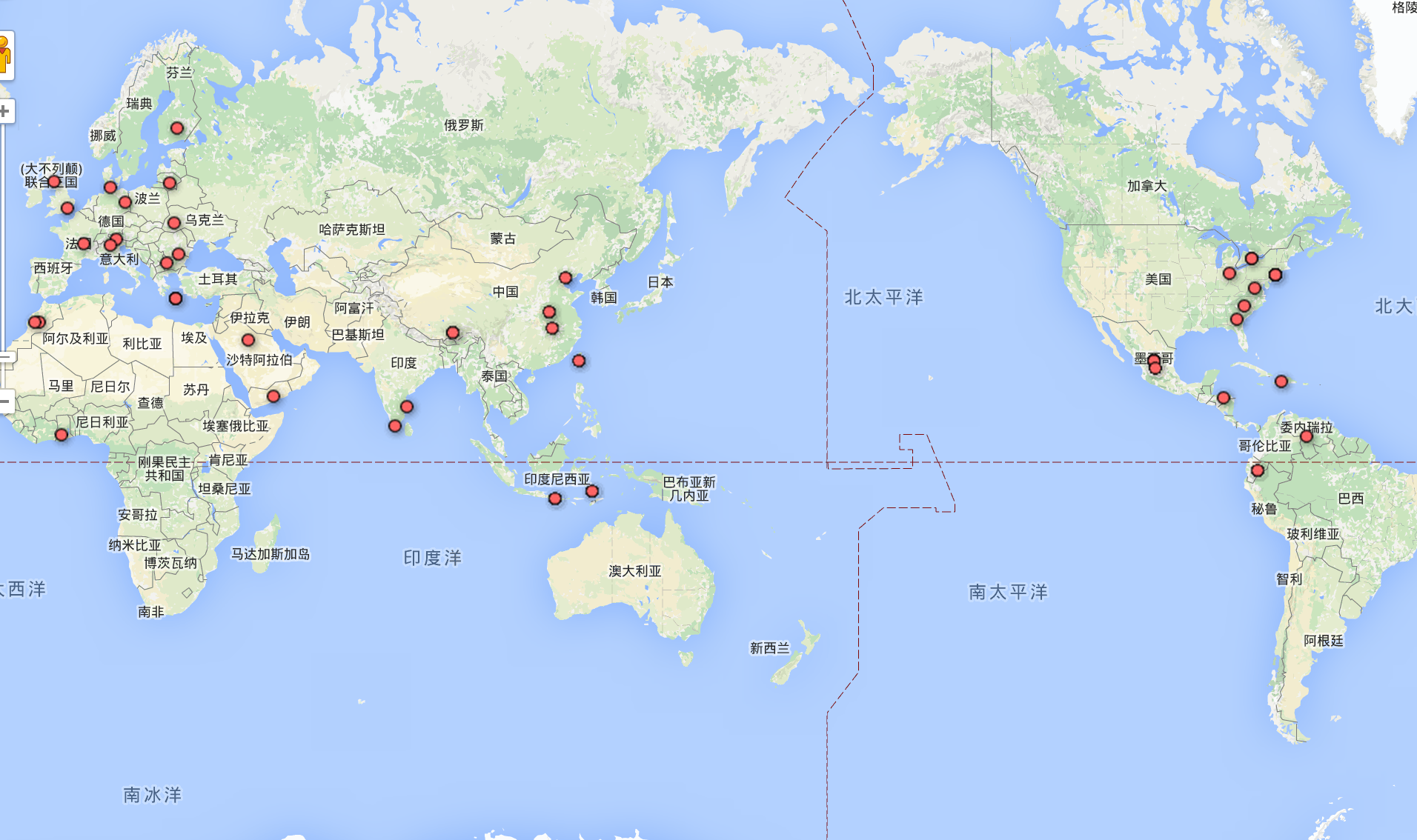
Figure b. Countries that lost the war

The last two visualizations are the relationship of the winning countries(labeled in blue) and the defeated countries(labeled in yellow). The more involved in the war, the bigger the dot is. What we can see is that China and US have large dots on the screen. For China, it is not surprised since it has lots of domestic or international conflicts at that time; but for the US, I am very surprised that it has involved in so many wars, in which I previously thought impossible since it is far away from the “main world”, Europe. Though, the most interesting fact is that many large dots on the graph are those who are involved in a civil war instead of the famous two World Wars. The reason for this fact might because that civil wars tend to make an influence on a vast area of the land, and tends to last longer as it is difficult to kill all the rebellions. Since that the scale of the war is not part of our raw data(especially how many people dies), this might seems misleading in the sense that large dots might not make people suffer more. But still, it can show things up; although in the future we might go and think more about making a visualization: to make it least misleading as possible.
As we can see, America involves in the war a lot, as it is a very big dot on the screen.


Leave a Reply