Since I was using default data set from Palladio, which is not an ideal data set for testing Gephi, I chose a different data set this time. The data set contains information of 50 movies selected from top 250 movies on IMDb. The raw data is in CSV format and looks like this:
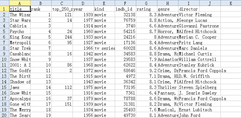
it contains various information including year of production, director, genre and etc. Since there is no strong geological connection between each movie, I do not think Palladio can be put into a good use so I chose Google Fusion Table. Under “Chart” option, I am able to get network graph, but it does not work well on my dataset:
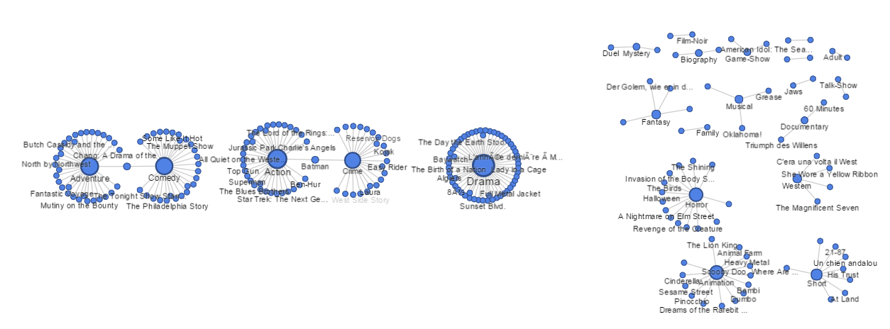
Since Google Fusion Table only support making connections between two columns, the graph does not have too much value.
Other than network graph, the card view can be useful when audiences want to gain knowledge on specific movies. Information of each movie is collected and displayed individually, which might be good for quick referencing. However, I can hardly find any interconnections within these movies due to the nature of this type of visualization.
Gephi, on the other side, did a good job on displaying the network relation of different movies. These movies have all different kinds of relation. Sometimes one movie was inspired by some movies that already got a reputation and sometimes certain groups of director always filmed good movies. All the relationships like these can be best represented by the network. For this time, I chose 50 movies out of 250 in total and constructed the network by the relationship of movies and their genres. The visualization I had looks like this:
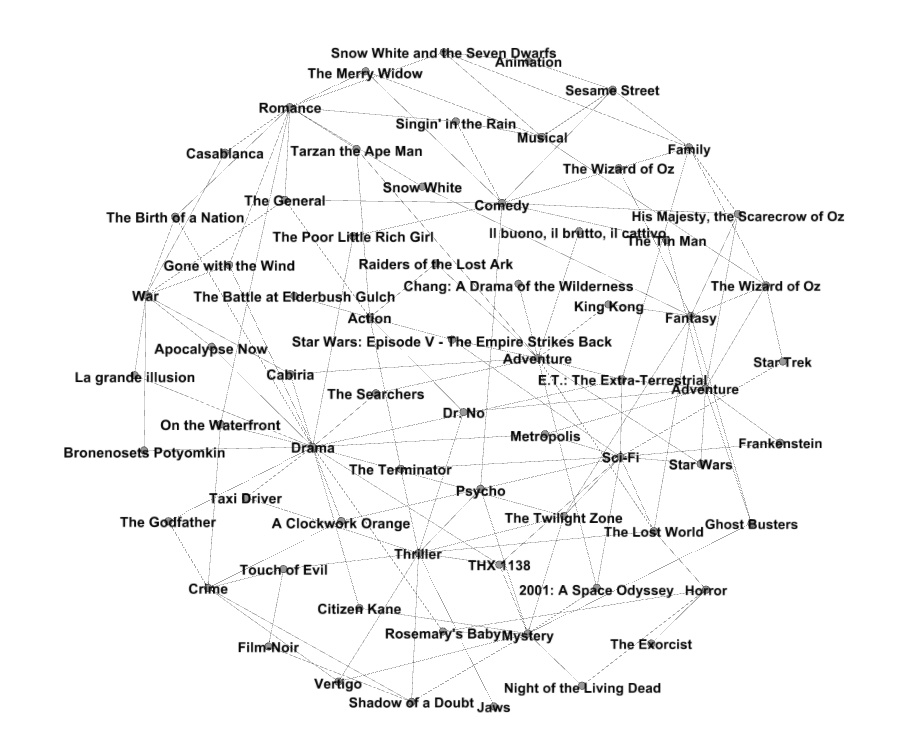
I first load all movies and genres into Gephi and then connected them according to movies’ genres. The final result is an undirected graph and edges are not weighted. It looks great and provides a lot of useful information on the relation of most succeed movies and their genre. For example, we can see that there are the great amount of movies are under genre “Drama” and most succeed movies always have multiple genres covered. Another interesting fact about this graph is that we can see the similarities between movies. For example, the movie “Star Wars: Episode V – The Empire Strikes Back” is connected with other movies such as E.T and 2001: A Space Odyssey, which indicates they tend to have similar genres and thus potentially favored by the same group of viewers.
Personally I do not think Google Fusion Table and Gephi shares too many commonalities. Since this data set has no geographical information within it, the Fusion Table only generates list view and card view, which does not help much on constructing the network. For Gephi, it is much better on creating a network and thus a good fit to my data set. What is important when using Gaphi is that the author him/herself need to have a clear understanding on what kind of connection the visualization is trying to represent. For this visualization, I simply put both movie titles and genres as nodes but ideally genres should belong to movies as a feature. By doing this, we should be able to fully unleash the power of Gephi by getting a statistical analysis of data set such as centrality and degree of partition.
Due to the nature of the network, we should not show all relationships at one time. The complicated graph will make the network unreadable and thus become less useful. We should only pick certain relationship that we curious about and only connect nodes when needed. The graph I got is not heavily centralized because every film only has about three or four genres at most and limited number of features indicate less degree. Gephi can help us calculate the molecularity of a graph, which can further prove my point:
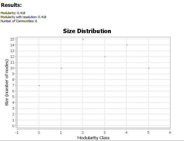
It shows that the graph is slightly centralized and spread out evenly in general.
When I was preparing the data set, I just tried to found as much as information I can get but later on, I found the result means nothing. I did not have a clear mind on what kind of relationship I am interested in at the very beginning and such mindless searching made the graph useless. Like Lima said, “if you don’t really know why you are collecting it, you are hoarding it. “(Lima, p. 82) This is probably the biggest mistake I made when preparing data. It is the quality, rather than quantity of data that really value a graph. The author should not be greedy and try to include everything in one graph.
Leave a Reply