Two unfortunate, misrepresentative, tea-themed visualizations:
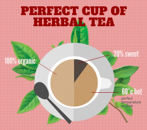
The “Perfect Cup of Herbal Tea” is subjective to begin with, but the visualization above adds to the confusion – dividing the cup of tea into three sections: “20% sweet,” “60 degrees Celsius hot,” and “100% organic.” The numerical labels initially imply a pie chart, but none of the values are represented with an accurately sized ‘slice’ of the tea, and “60 degrees” is not a percentage value.
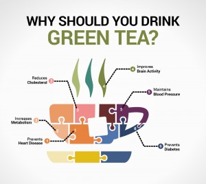
In the visualization above, the arguments for “Why Should You Drink Green Tea?” are represented as labeled puzzle pieces forming a cup of tea. Not all of the puzzle pieces are labeled, making the visualization appear sloppy and unfinished, and there seems to be no rhyme or reason why a particular argument for drinking green tea corresponds to a particular puzzle piece. The numbers and colors seem to be randomly assigned as well. The information is more difficult to digest in this visualization than a simple list of reasons for why you should drink green tea.


Leave a Reply